



- Sector
- Children’s healthcare
- Role
- Brand identity, 3D, digital, event and print
- Year
- 2023–2025
Korro
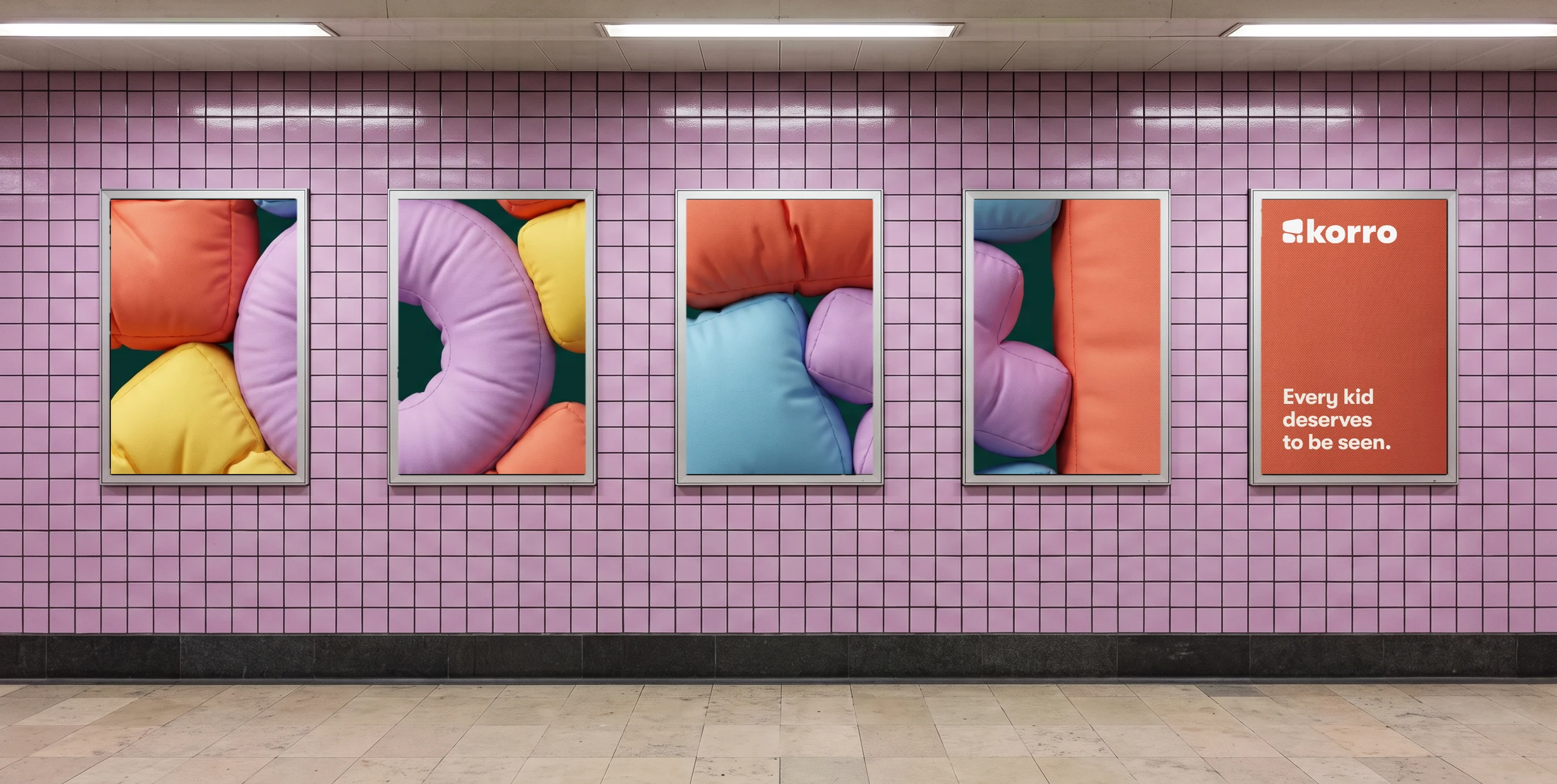
Every kid deserves to be seen.
Korro is a children’s healthcare and development platform. Its computer vision lets a therapist see how a child is doing, in the clinic or at home, through any phone.
They asked for a brand that children want to play with, parents trust and therapists rely on. I built it on a family of soft 3D forms, seven colours and a three-part symbol, and took it from the guidelines to the website, the conference booth and the printed kit.
- Symbol, wordmark, colour, type, tone of voice
- A library of forms, as stills and loops
- Website, product UI, social, newsletter
- Booth, backdrop, table, slides, webinars
- Leaflet, certificate, badge, mat, wristbands
- The brand book, from voice to product
One brand for the child, the parent and the therapist.
The child has to want to play. The parent has to trust it. The therapist has to rely on it. The brief ruled out anything childish, anything that looked like pure tech, and any single-colour brand.

Three shapes and a wordmark.
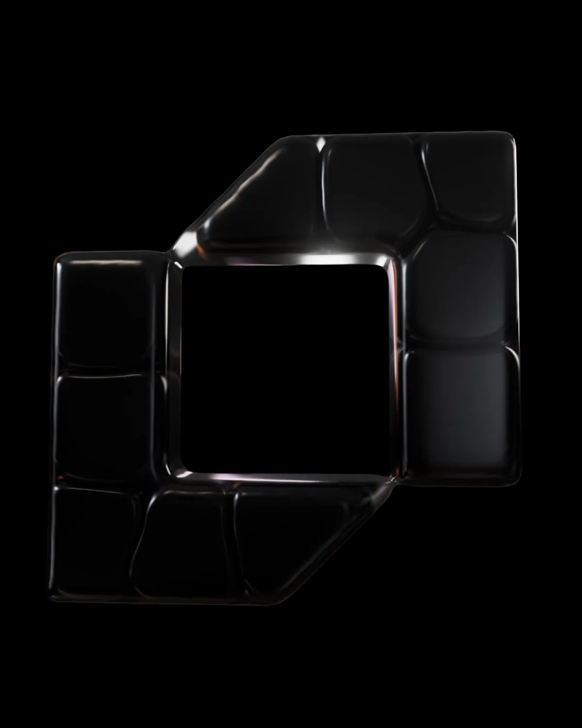
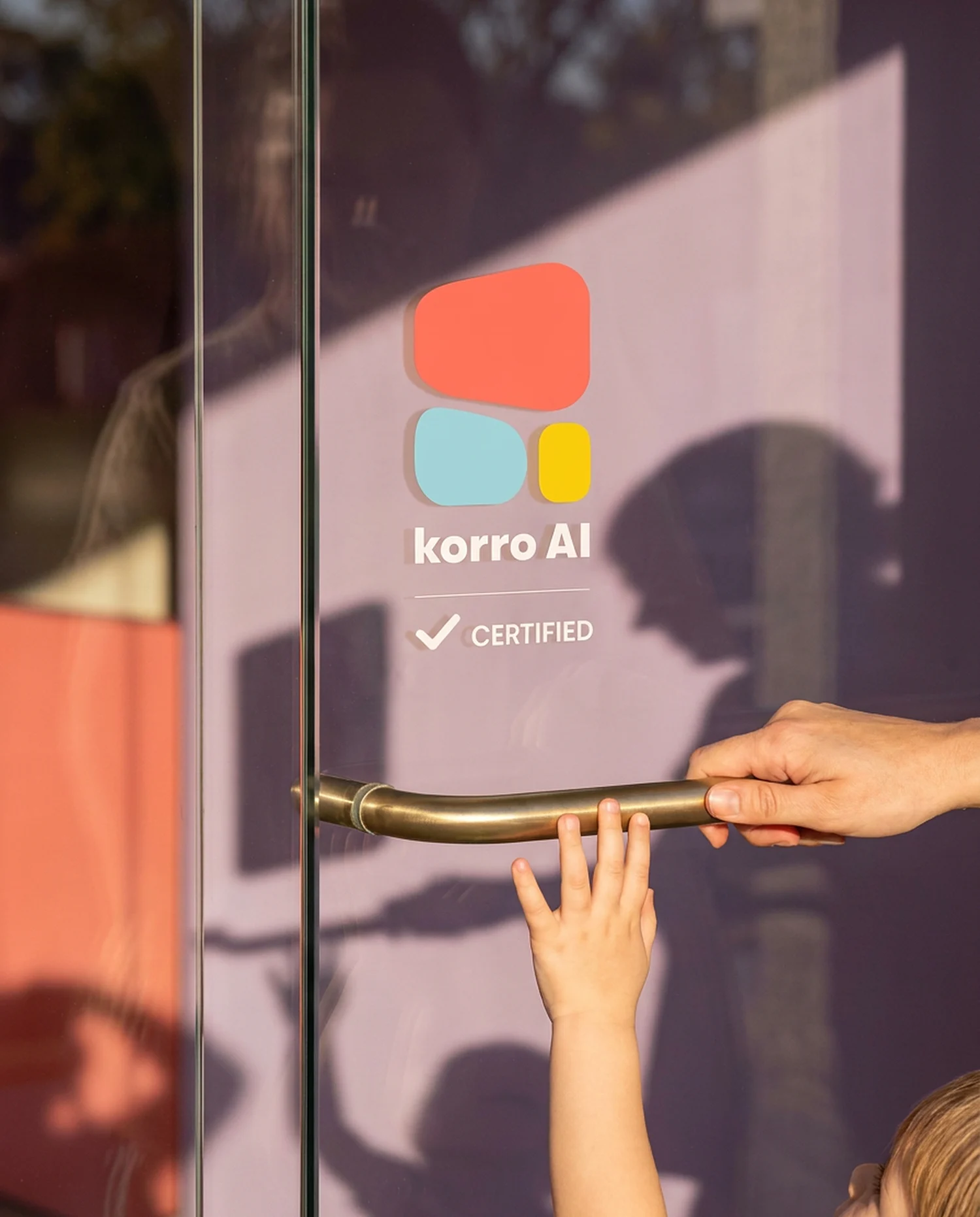
The symbol is three soft blocks in orange, light blue and yellow. It works on its own, next to the wordmark, and as the badge a certified clinic puts on its door.
Seven colours, each with a job.
Every colour is named for what it does: Innovative and Scientific, Imagination and Dreaminess, Optimistic and Playful, Sky, Highlighter, Warmth and Neutral. Headlines and text are set in GT Walsheim. Data is set in Space Mono.
Playful, tactile, fun.
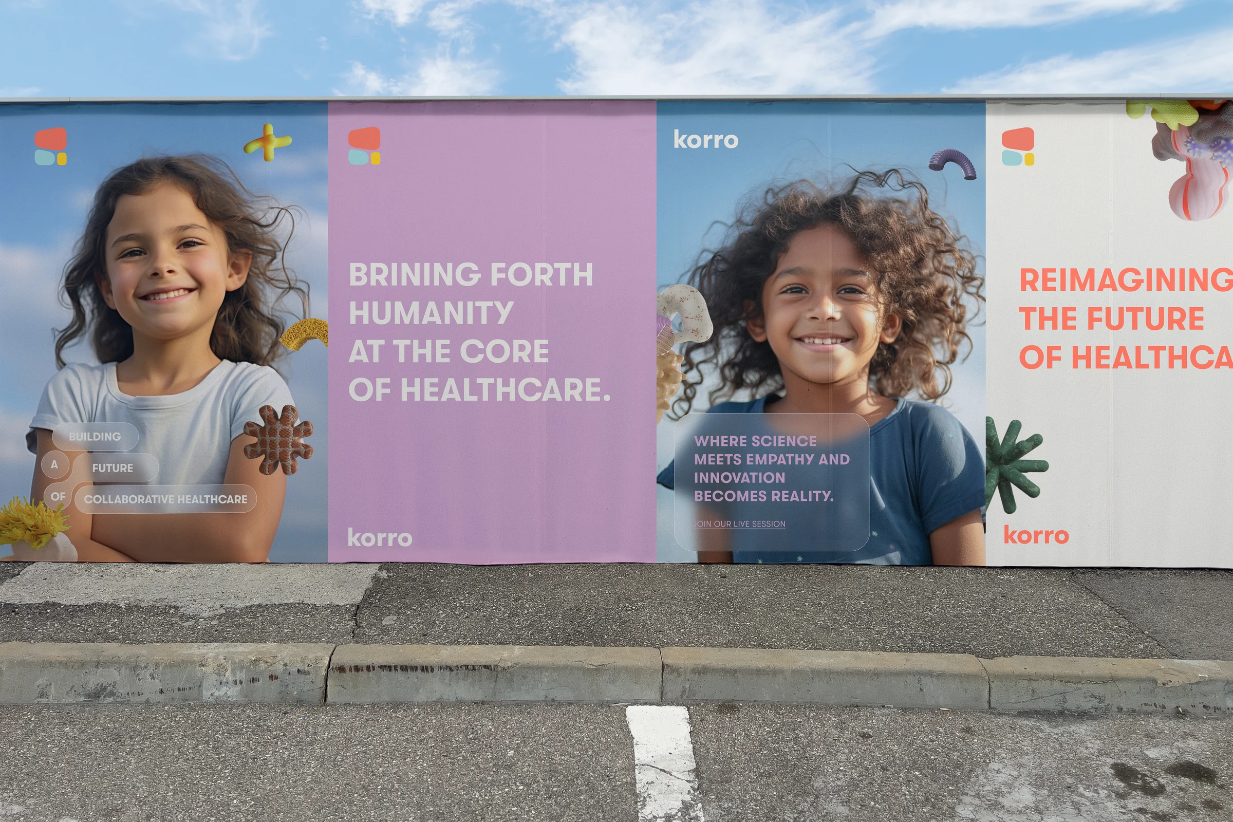
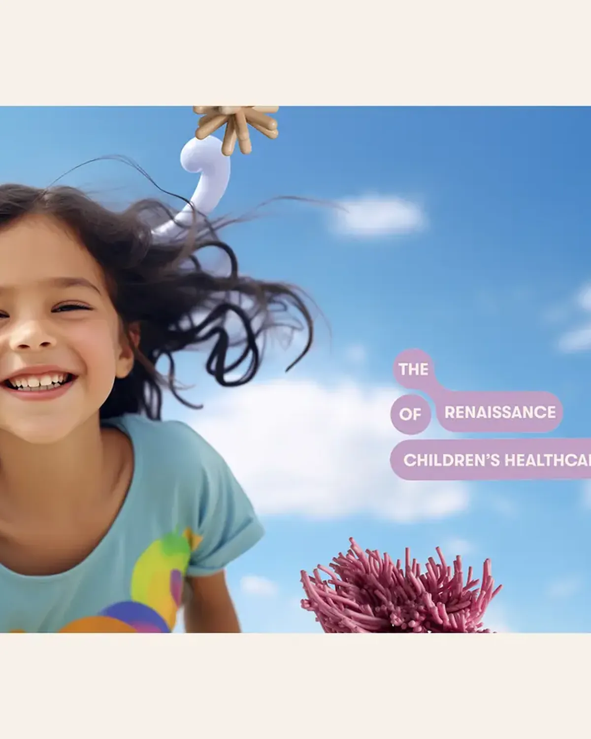
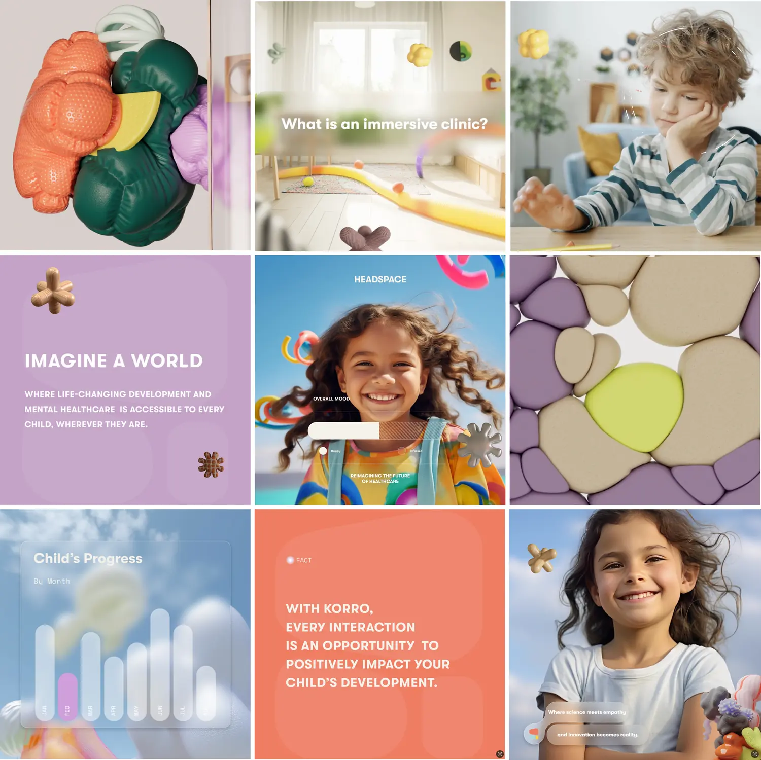
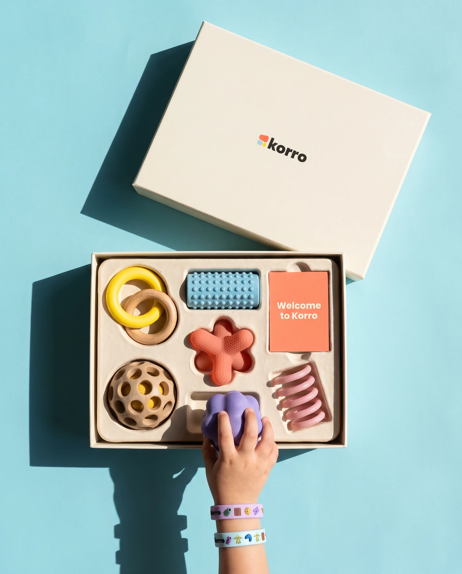
The 3D forms are the heart of the brand. They look like things a child would pick up: ribbed, knitted, rubbery, soft. I built the library in 3D so the same forms work as stills, as loops and as very large prints.
Welcome to the playground.
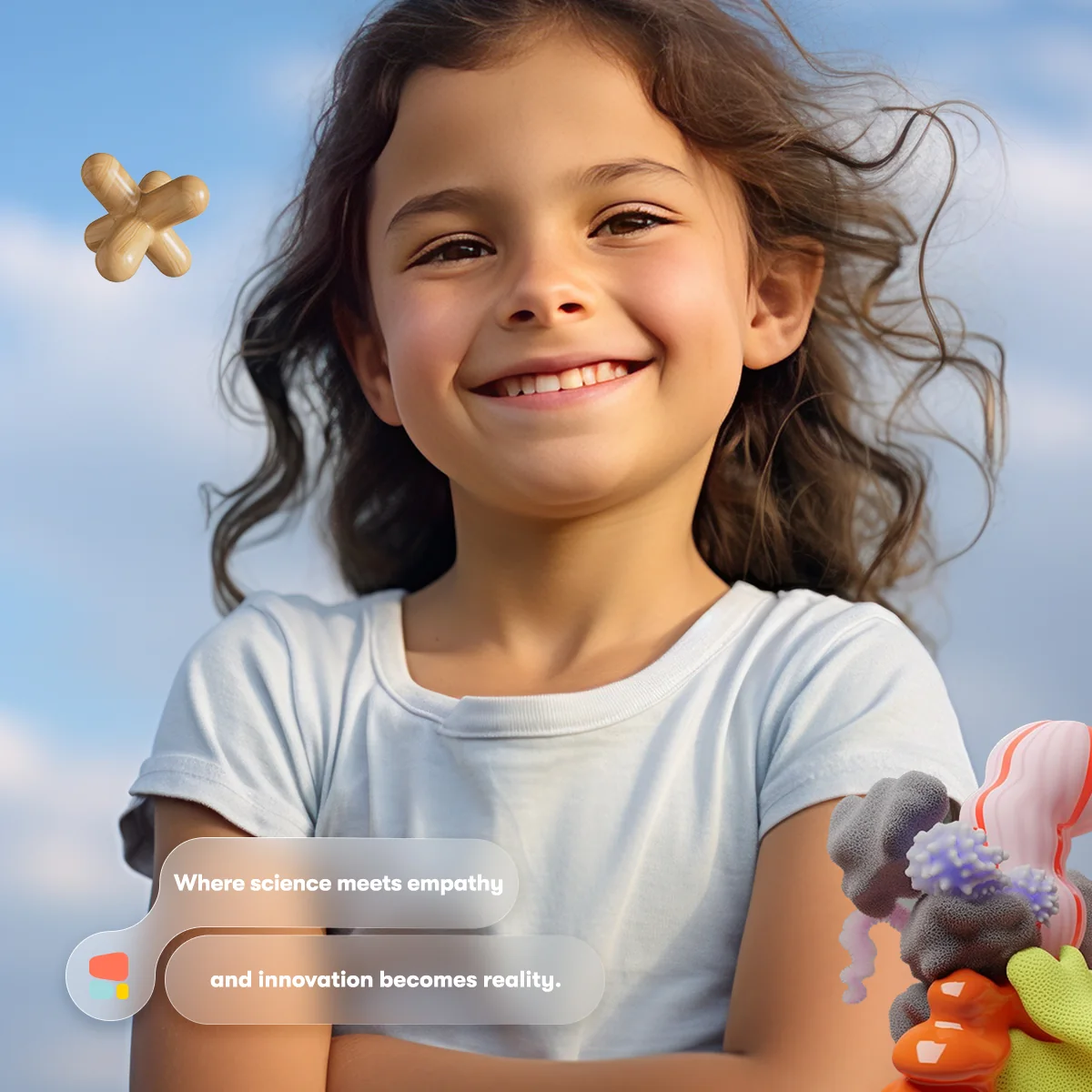
The photography is always a child, close up and happy, with the forms floating around them. The headlines are short and hopeful.
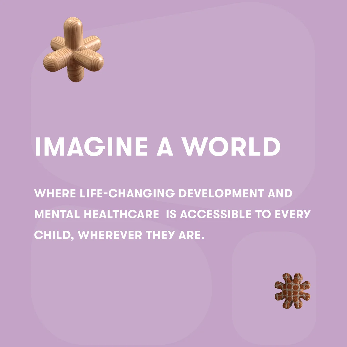
- Imagine a world.
- See. Feel. Analyze. Heal.
- Where science meets empathy.
- What if we rewrote the definition of healthcare?
Meet Korro.
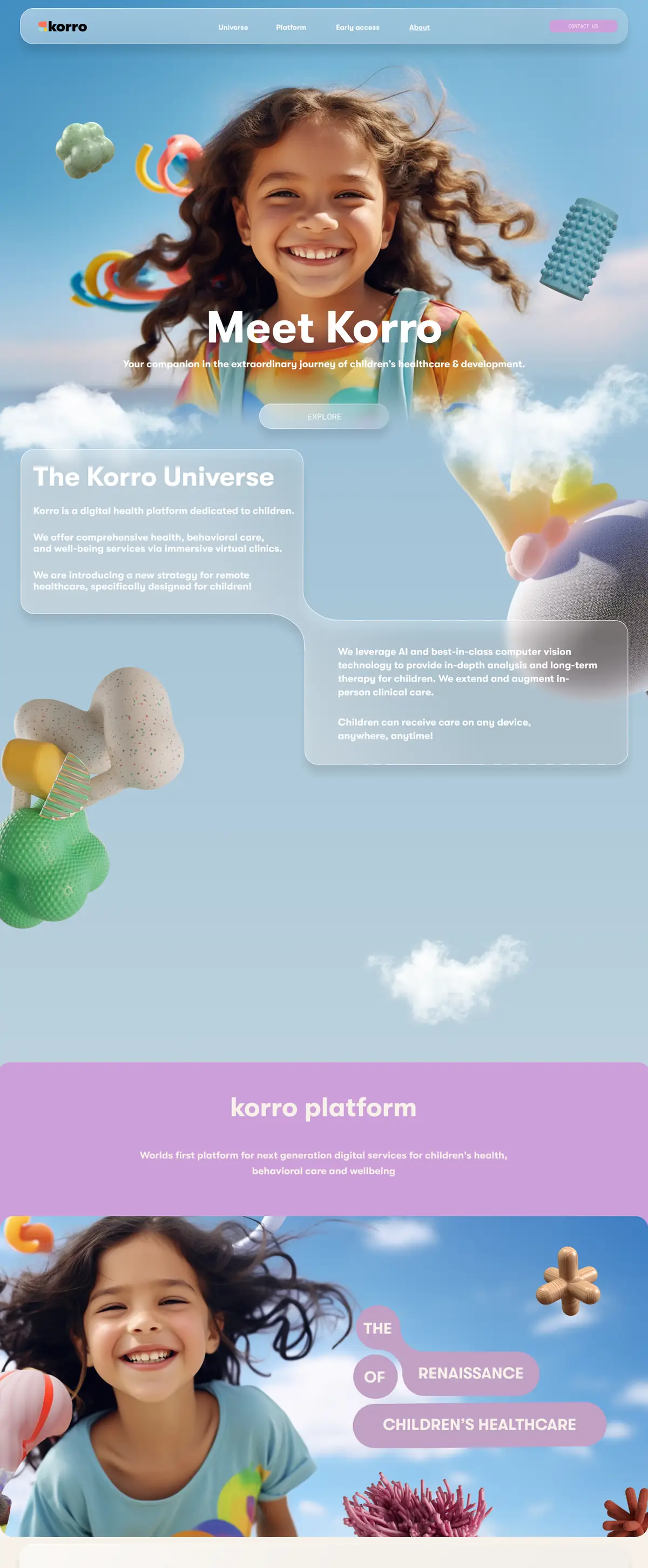
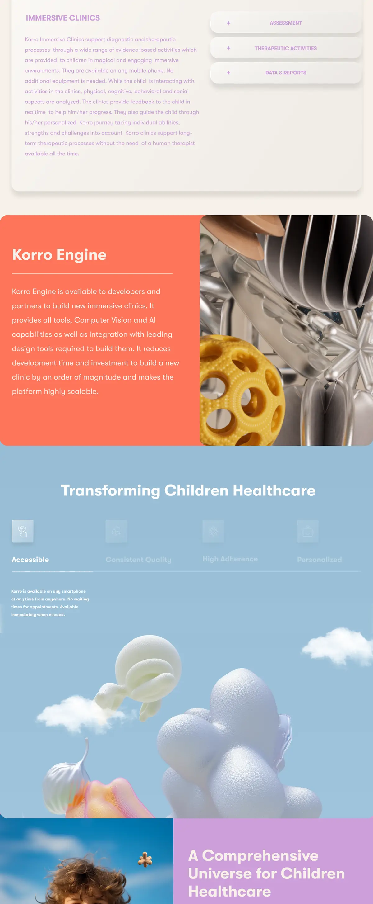
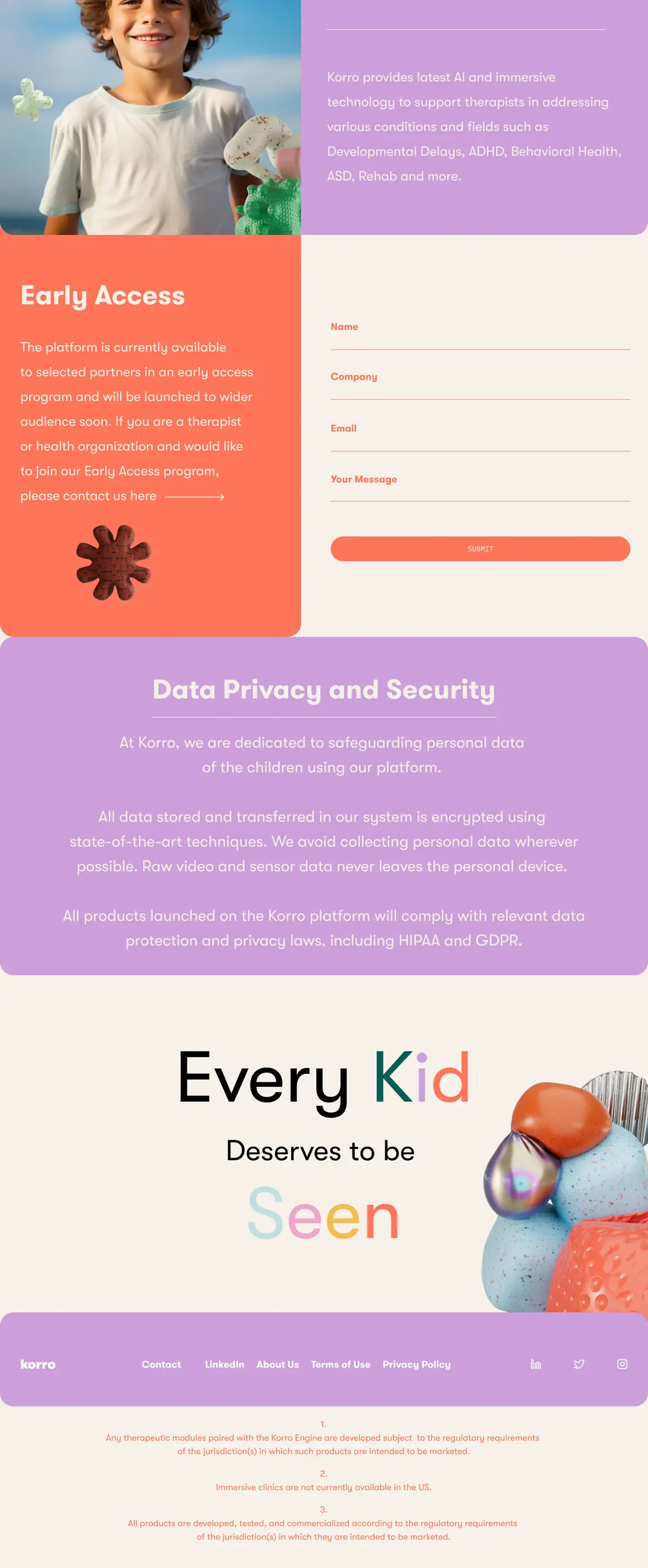
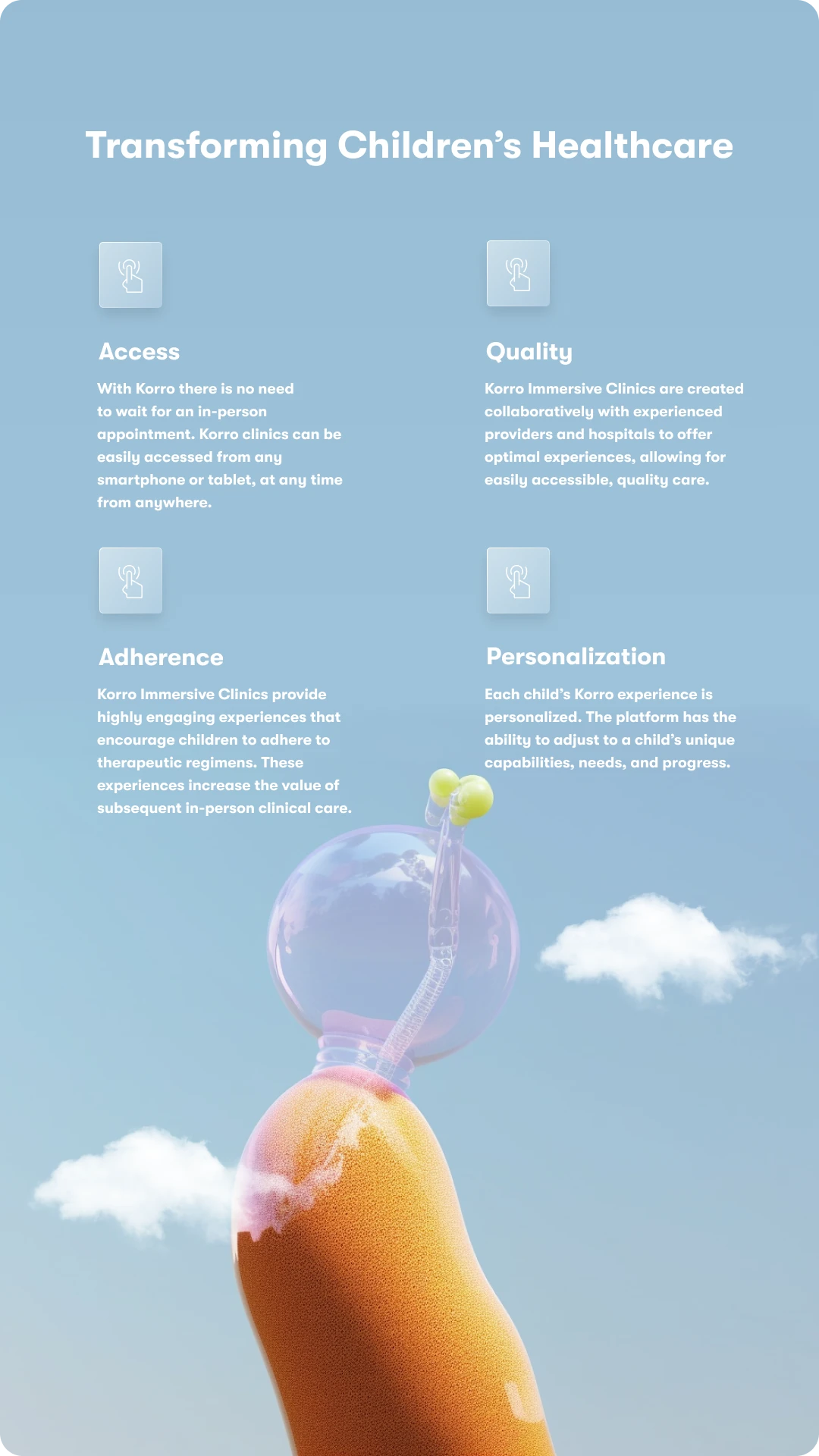
The homepage opens on a child and the sky, then walks through the platform, the engine and the clinics. Each section sits on its own colour from the palette.
The same language inside the product.
Charts, progress bars and mood trackers sit on frosted panels over the same sky and forms, so the data reads as part of the brand.
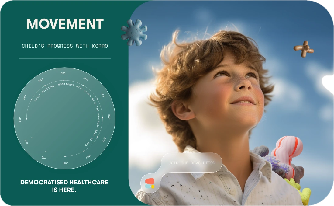
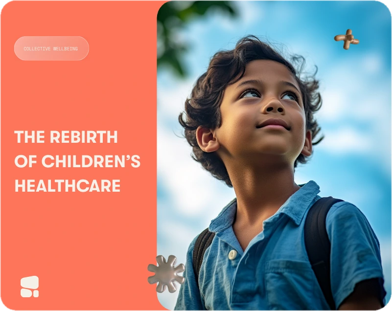
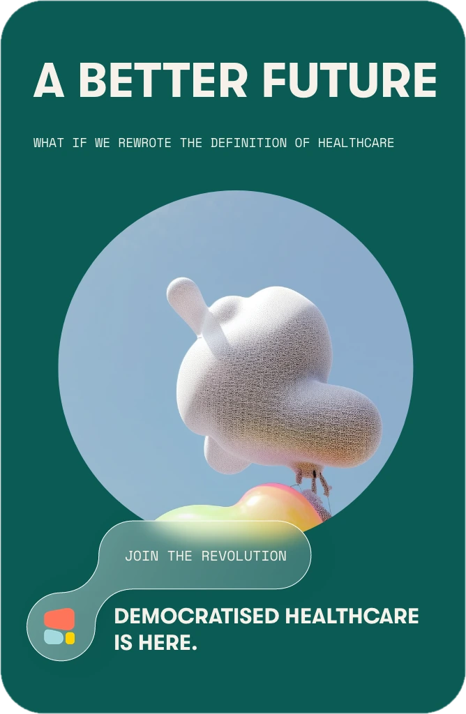
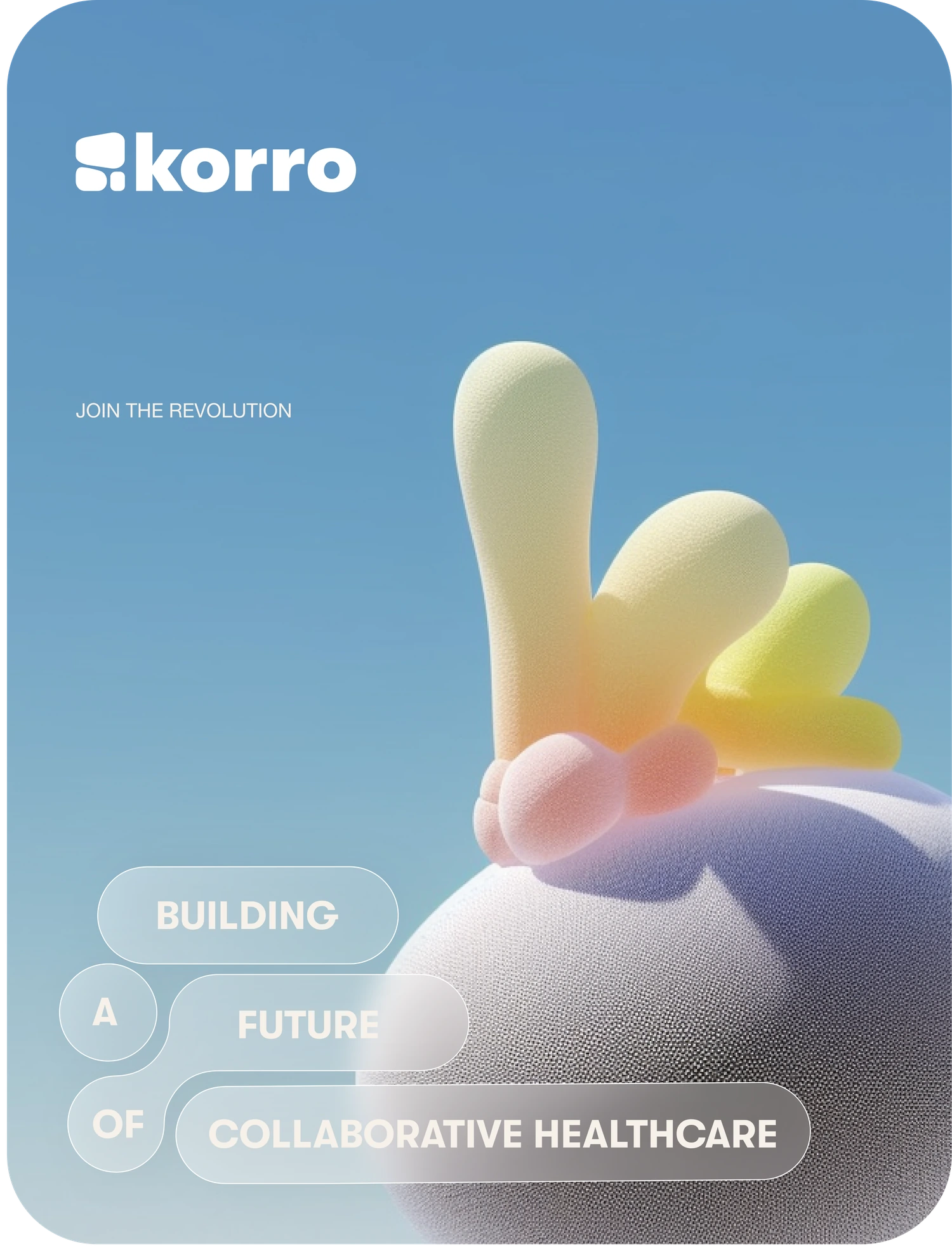
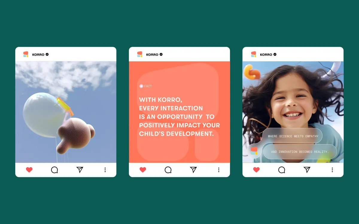
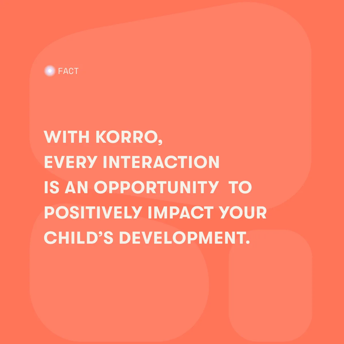
Posts and stories.
Templates for facts, quotes and product moments, in square and story formats, still and moving.
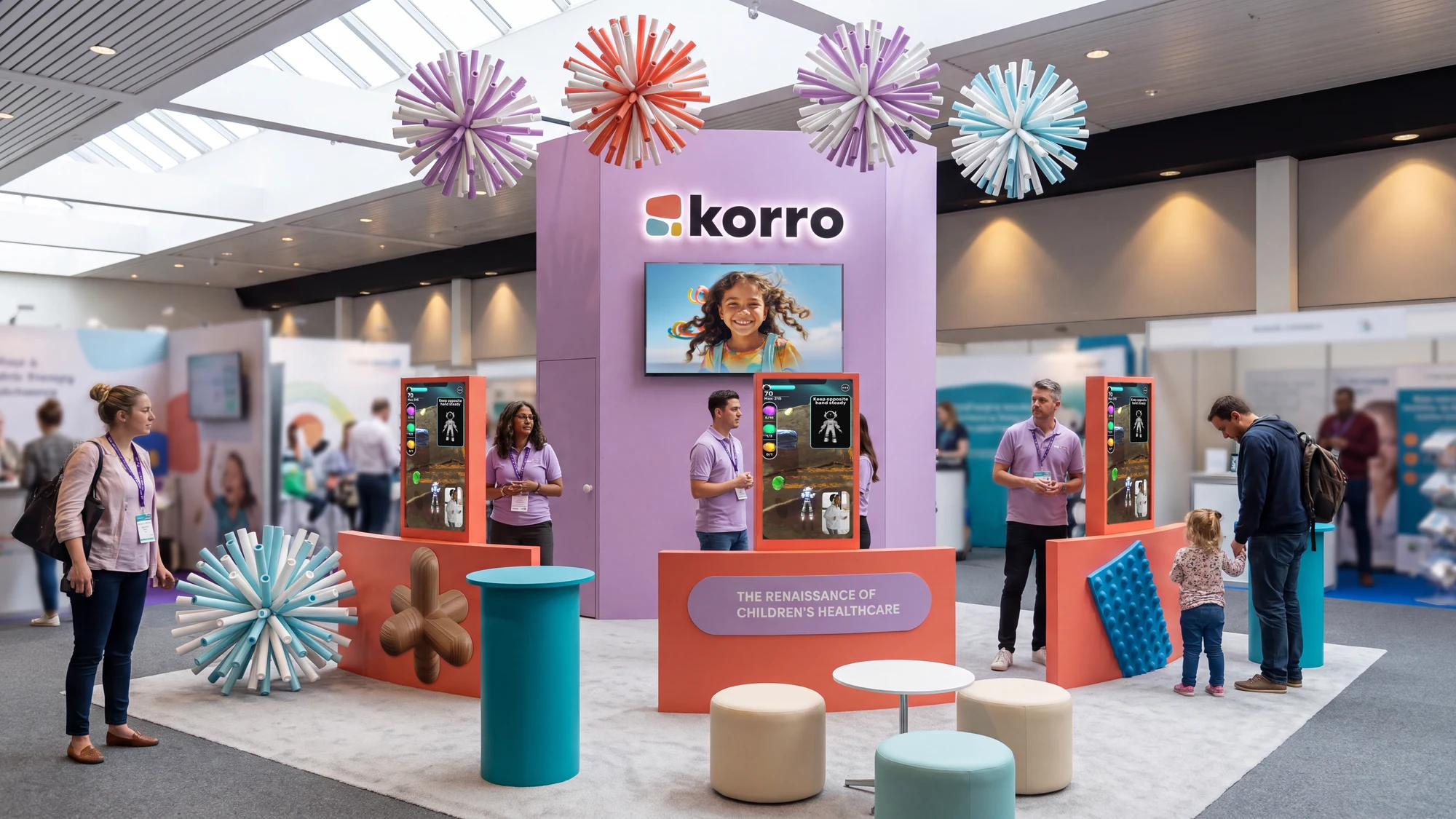
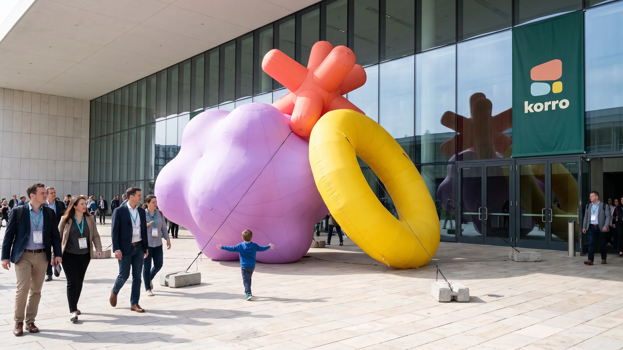
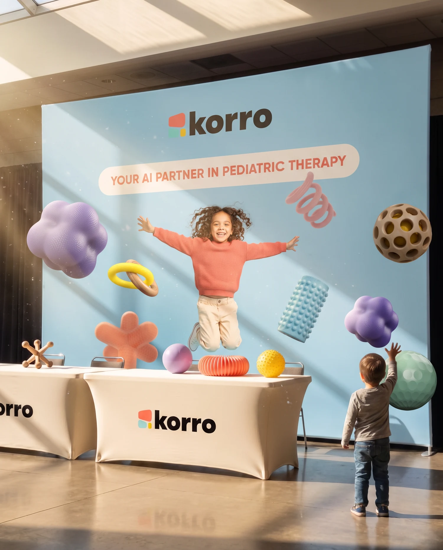
The conference kit.
For the occupational therapy conferences in the US I designed the booth, a backdrop, the table, the stage slides, the webinar invitations and inflatables for the entrance.
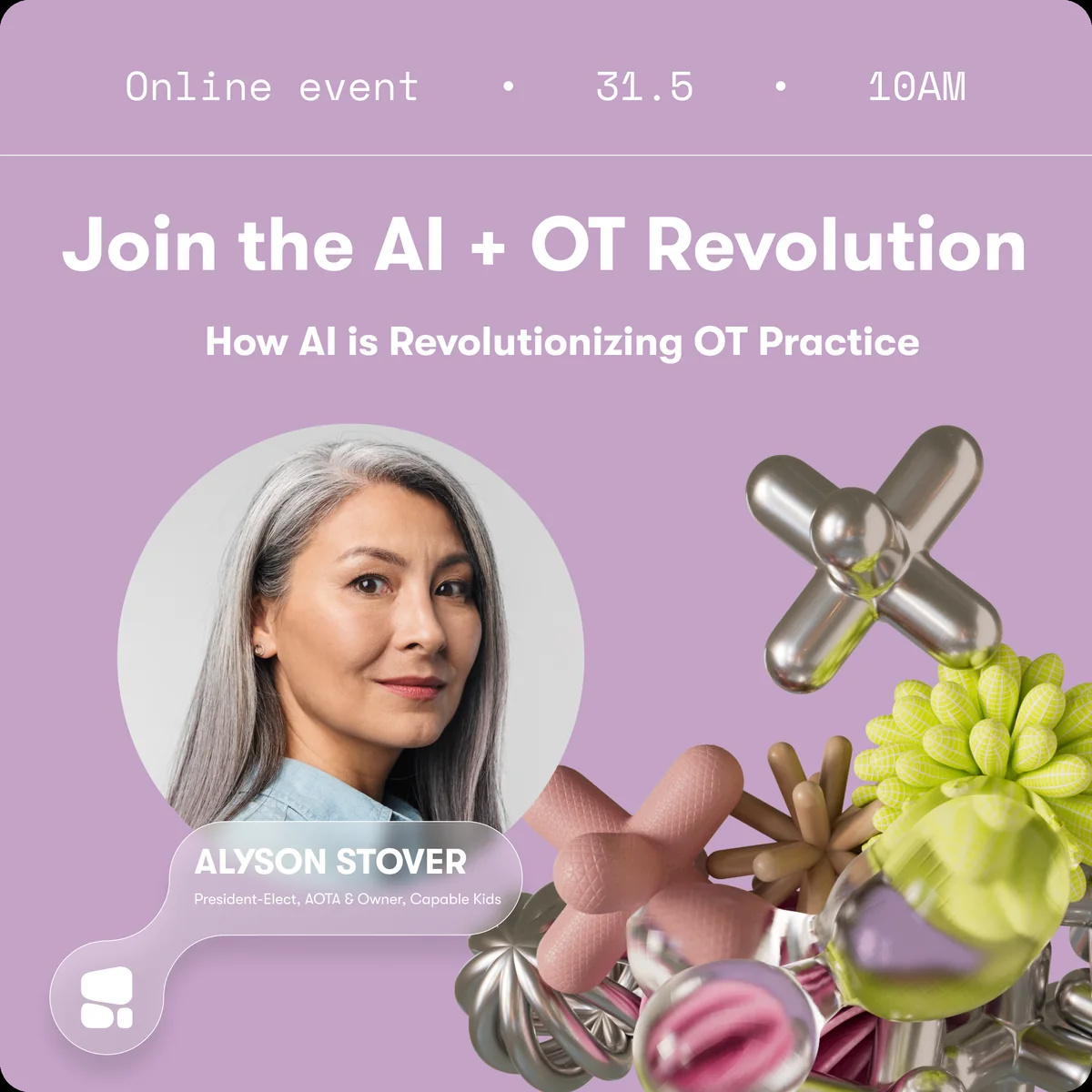
Things to take home.
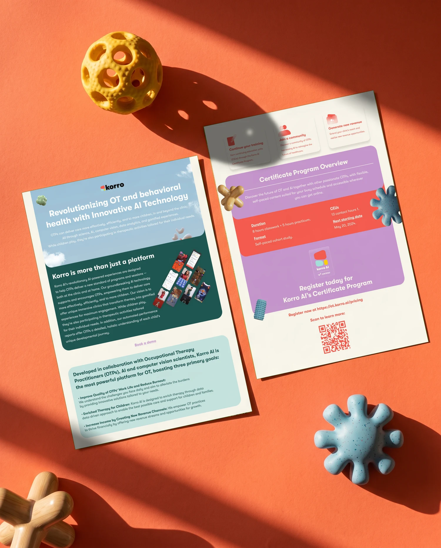
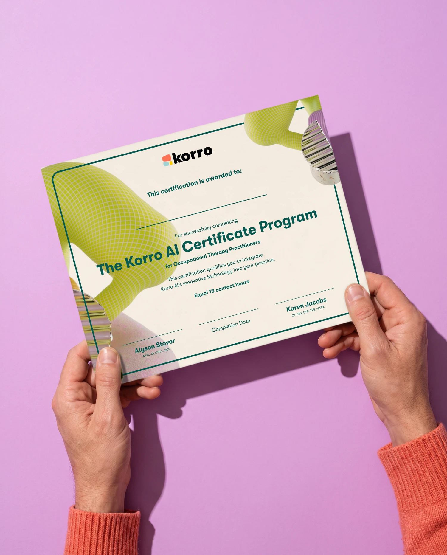
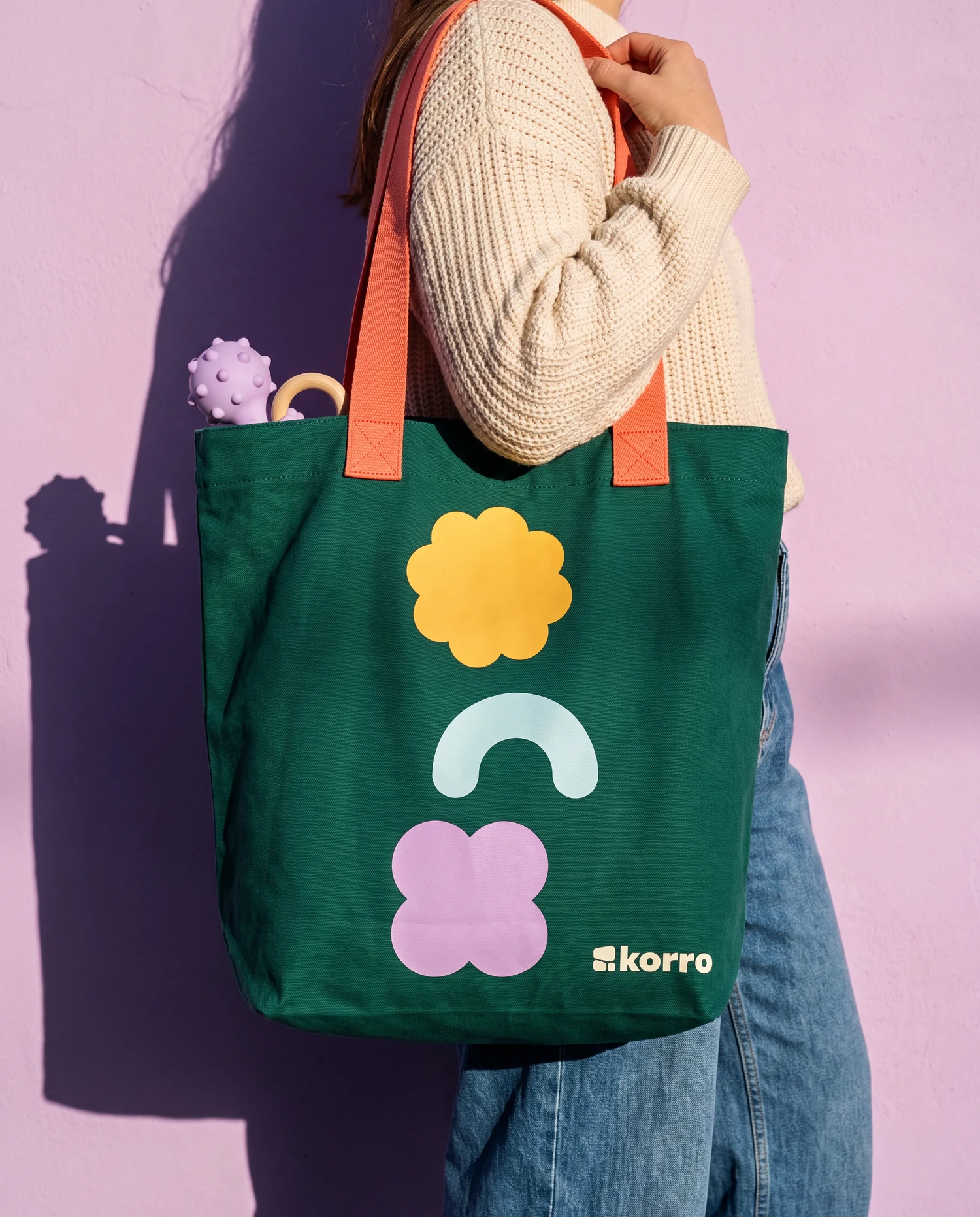
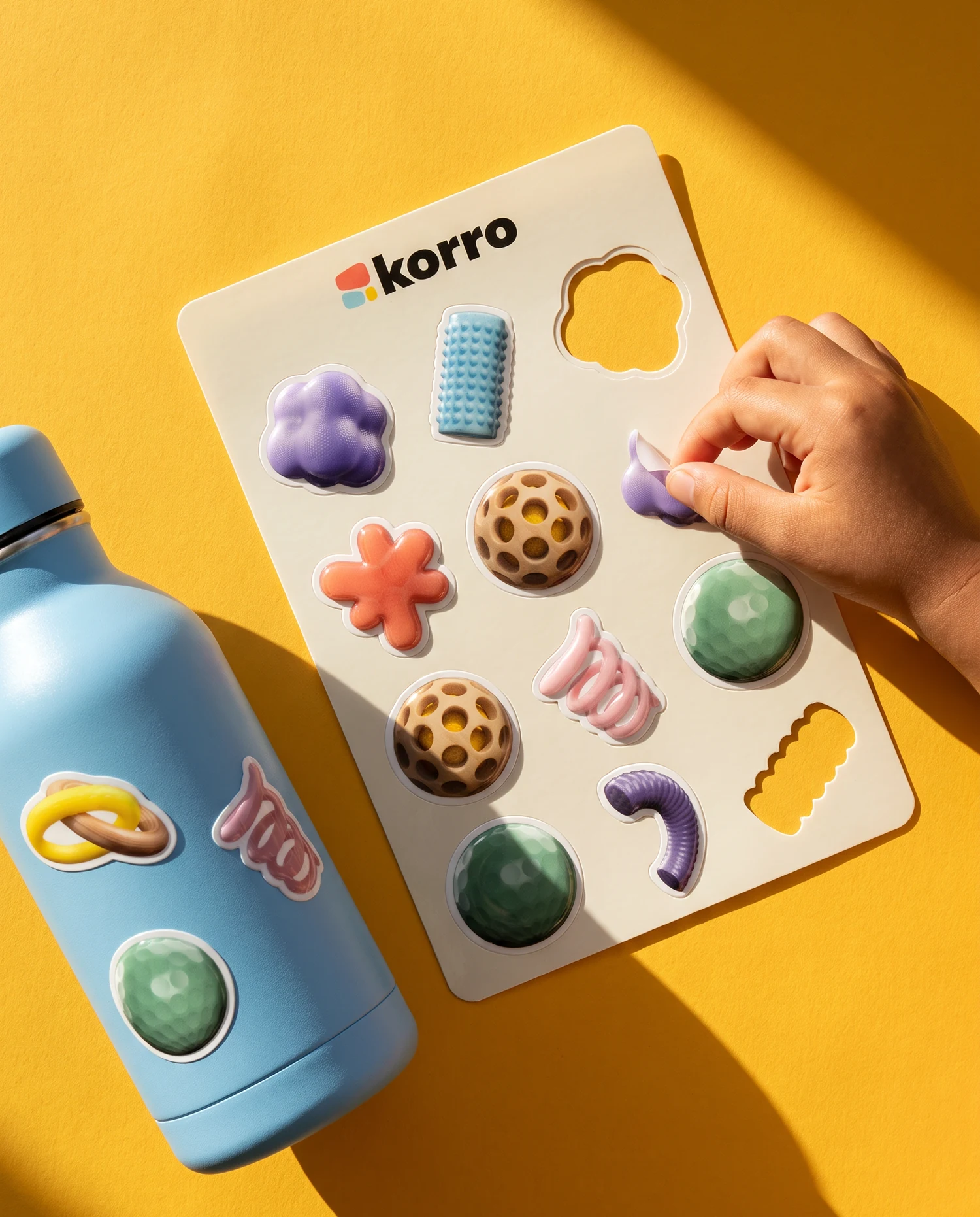
A leaflet for the certificate program, the certificate itself, a tote, a toy kit for new clinics, reward stickers and a badge for certified clinics.
The lines at full size.
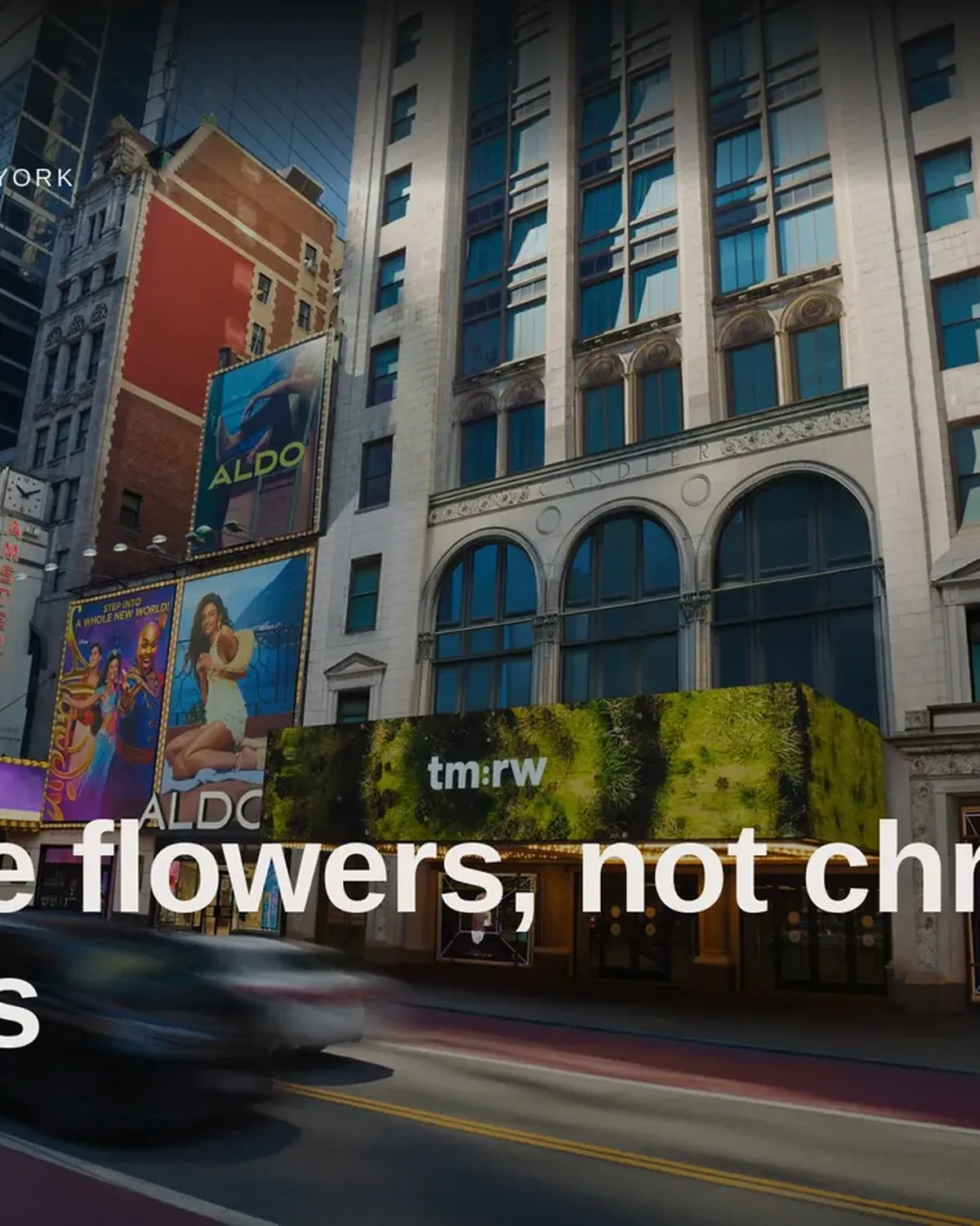
Three motion posters for street screens, and one idea that runs across five panels on a platform.