



- Sector
- Venture building
- Location
- Singapore
- Role
- Brand identity, motion, 3D, digital
- Year
- 2026
Liminal
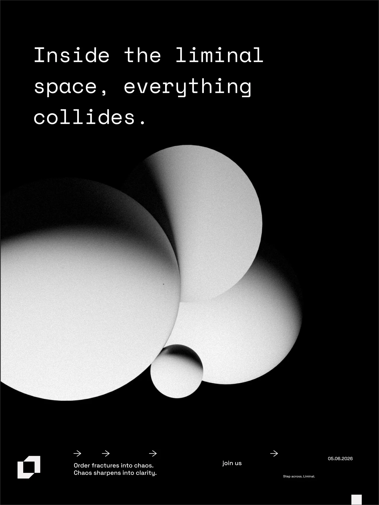
Inside the liminal space, everything collides.
Liminal is a venture builder in Singapore. They came to me for the branding and asked me to create a cult.
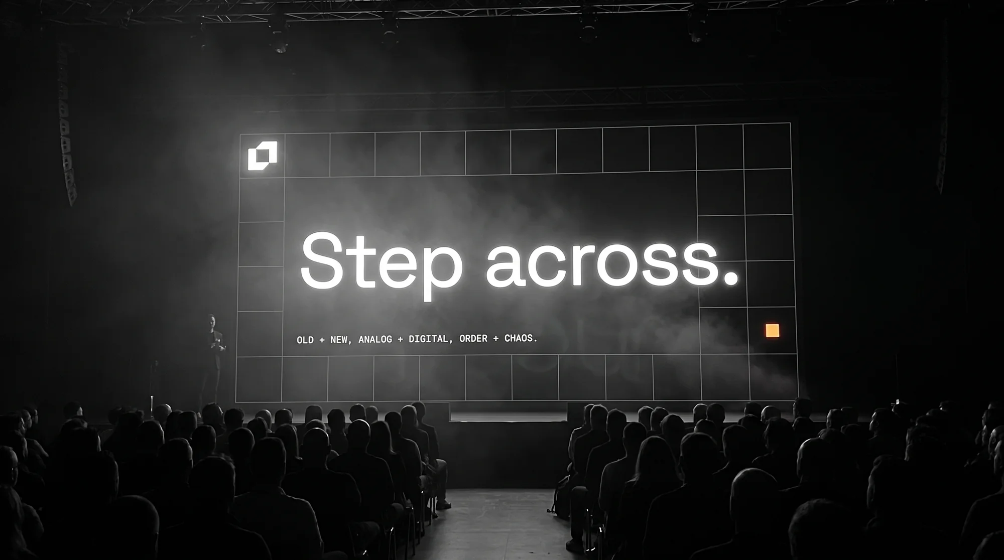
They wanted to be mysterious, creative and innovative. I built a generative, high-paced visual language to show that: one mark and one grid that stay fixed, and a surface on top of them that keeps changing.
- Symbol, wordmark, grids, colour, type, icons
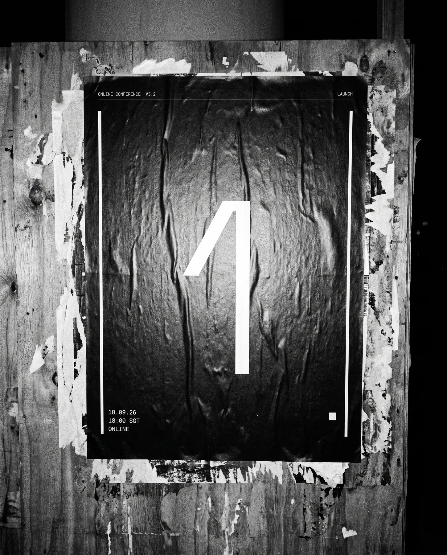
- Logo animation, grid systems, kinetic posters
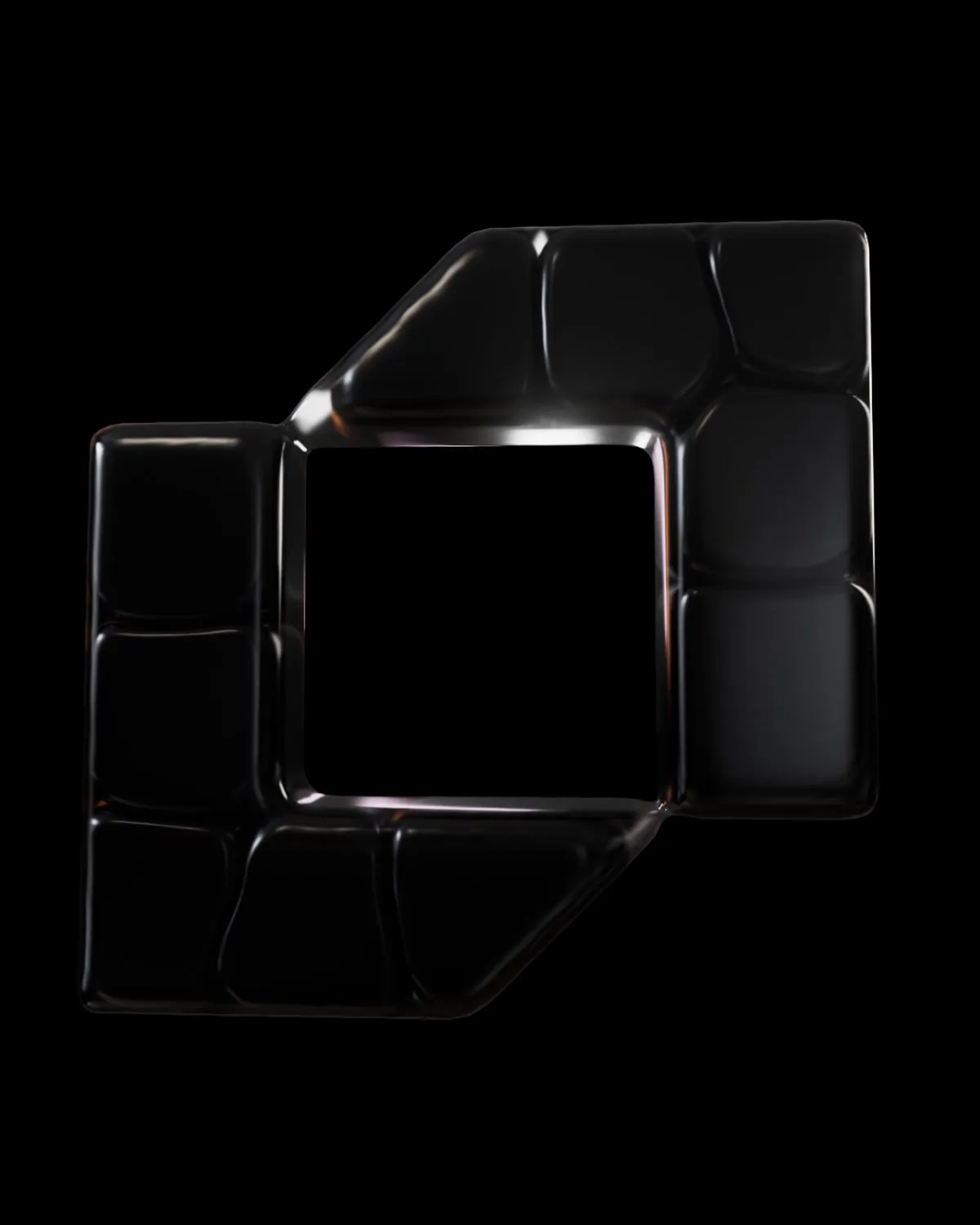
- Objects and totems, built in Cinema 4D
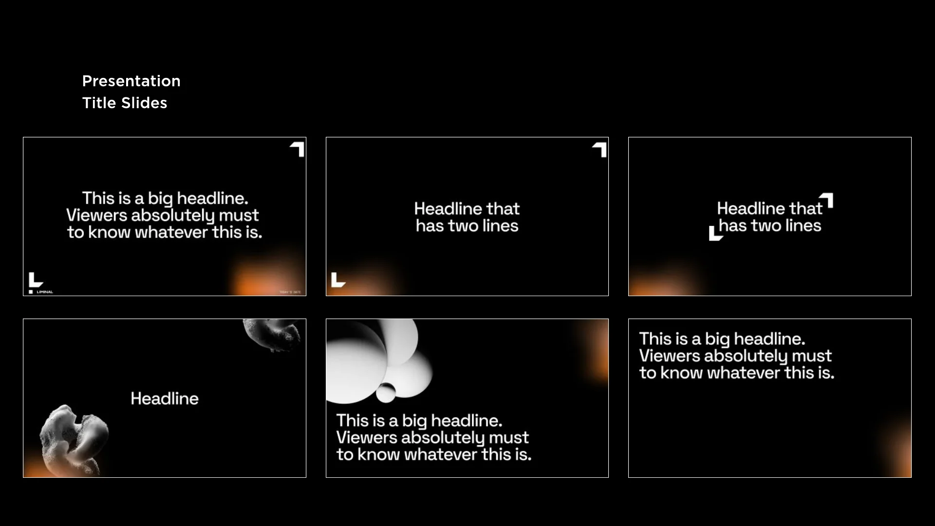
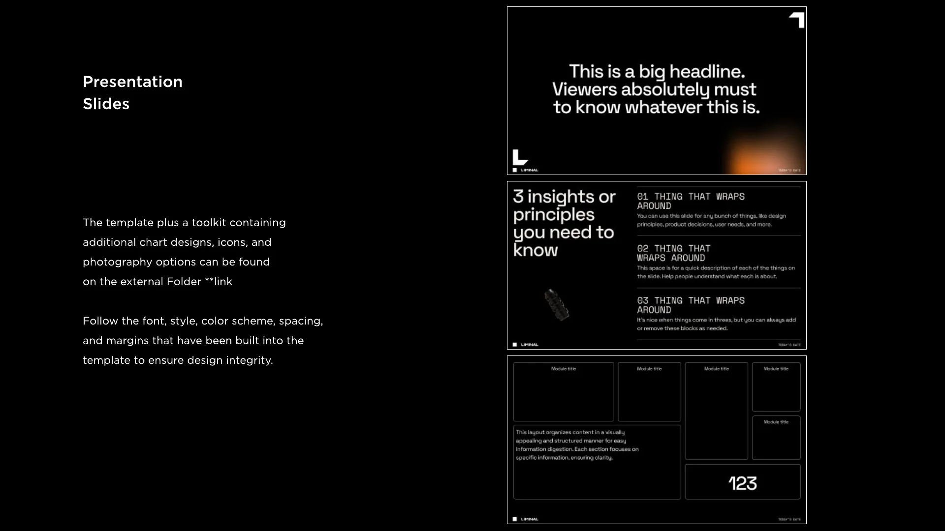
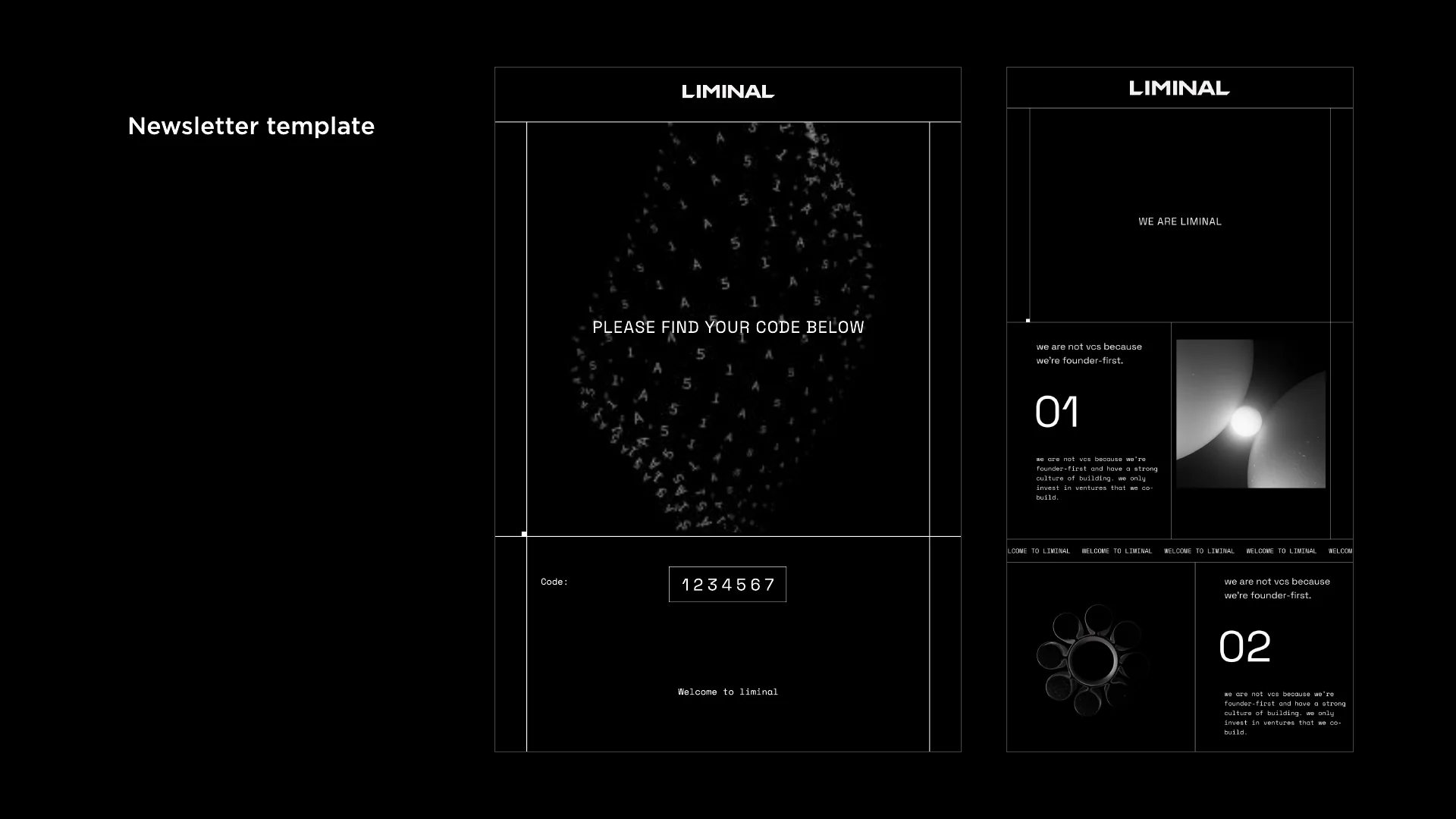
- Website, social, newsletter, slide templates
- The brand book, from story to applications
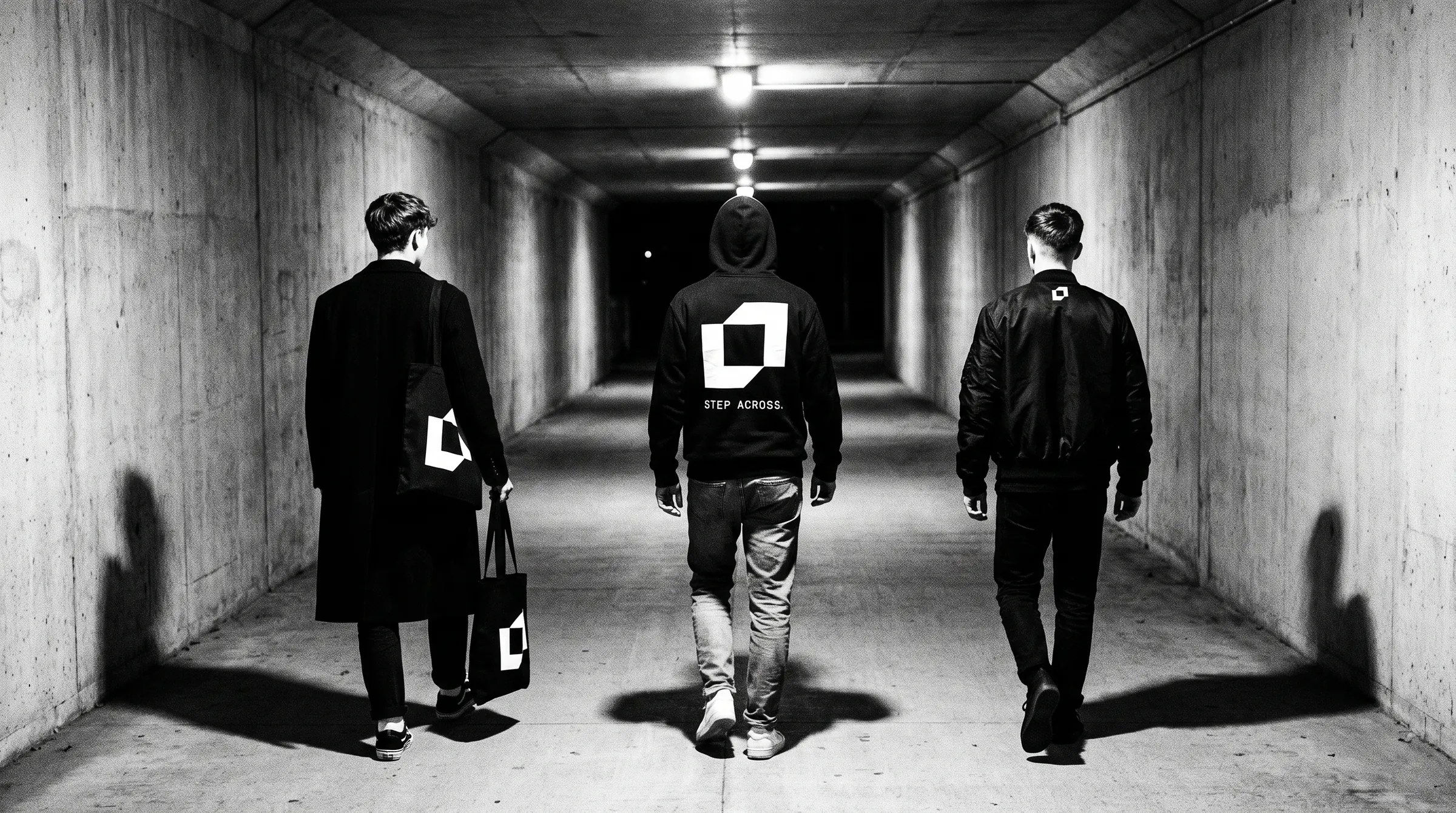
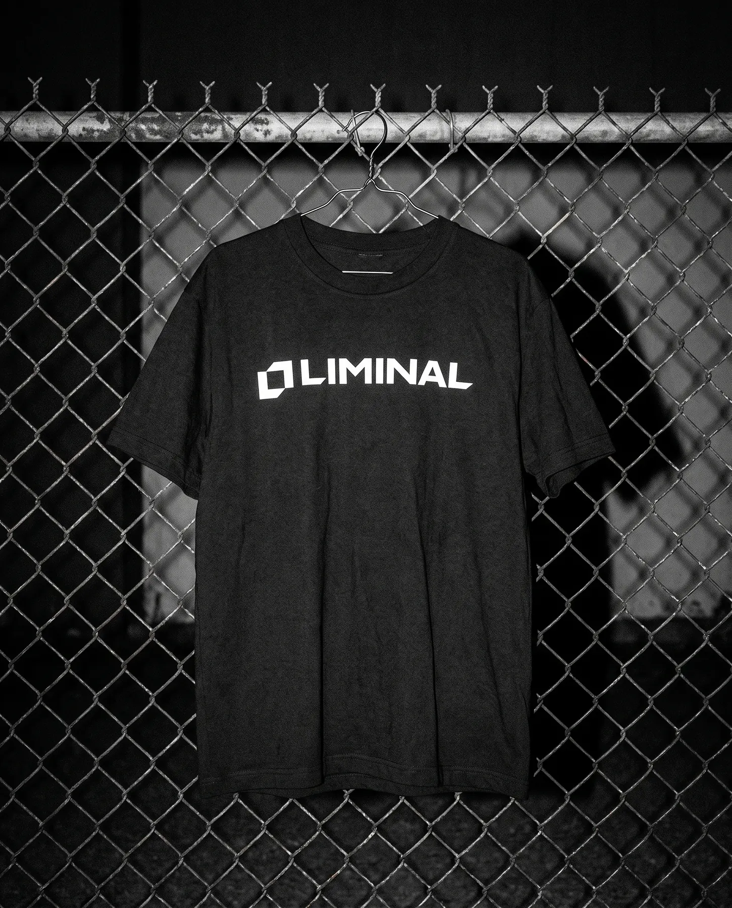
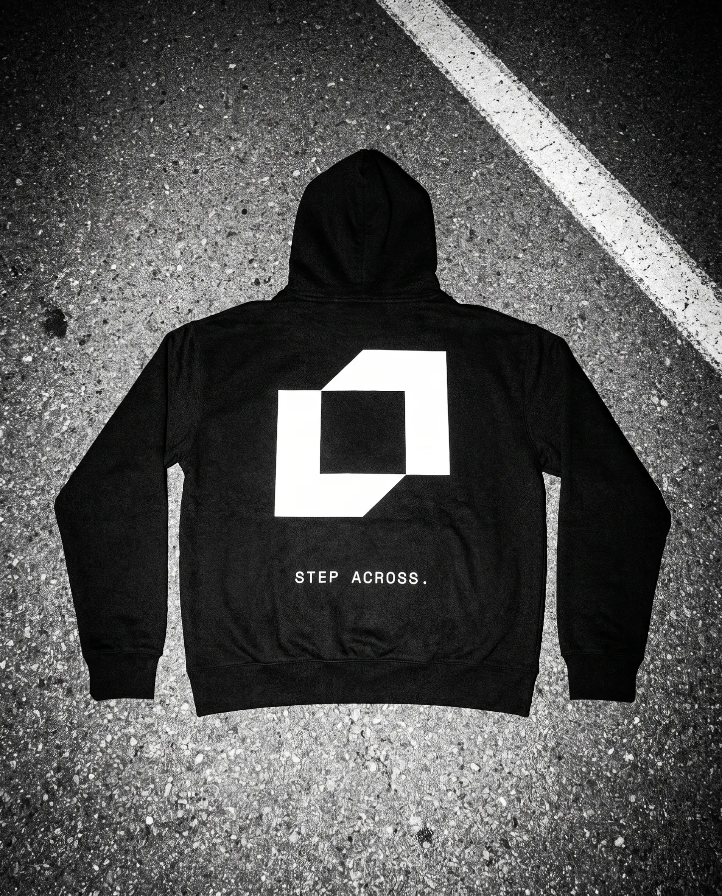
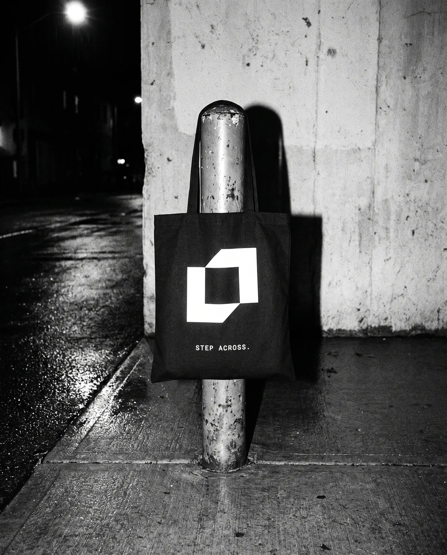
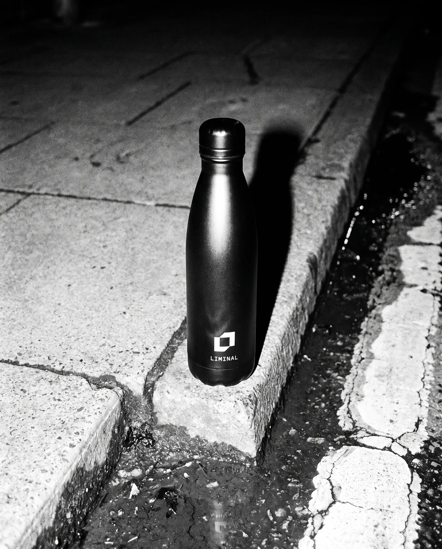
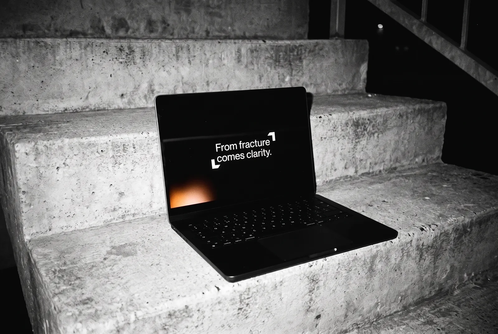
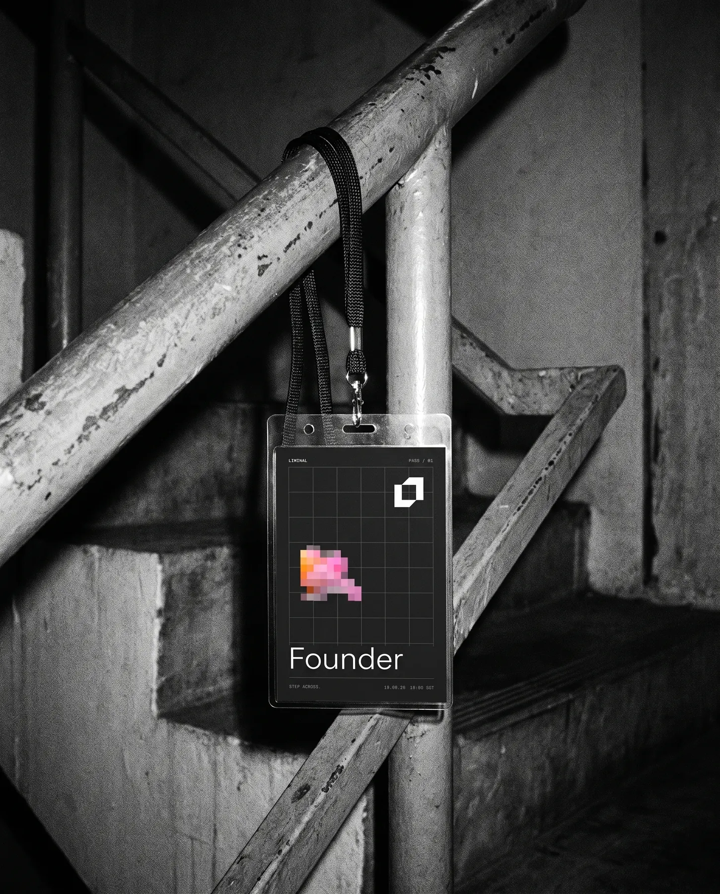
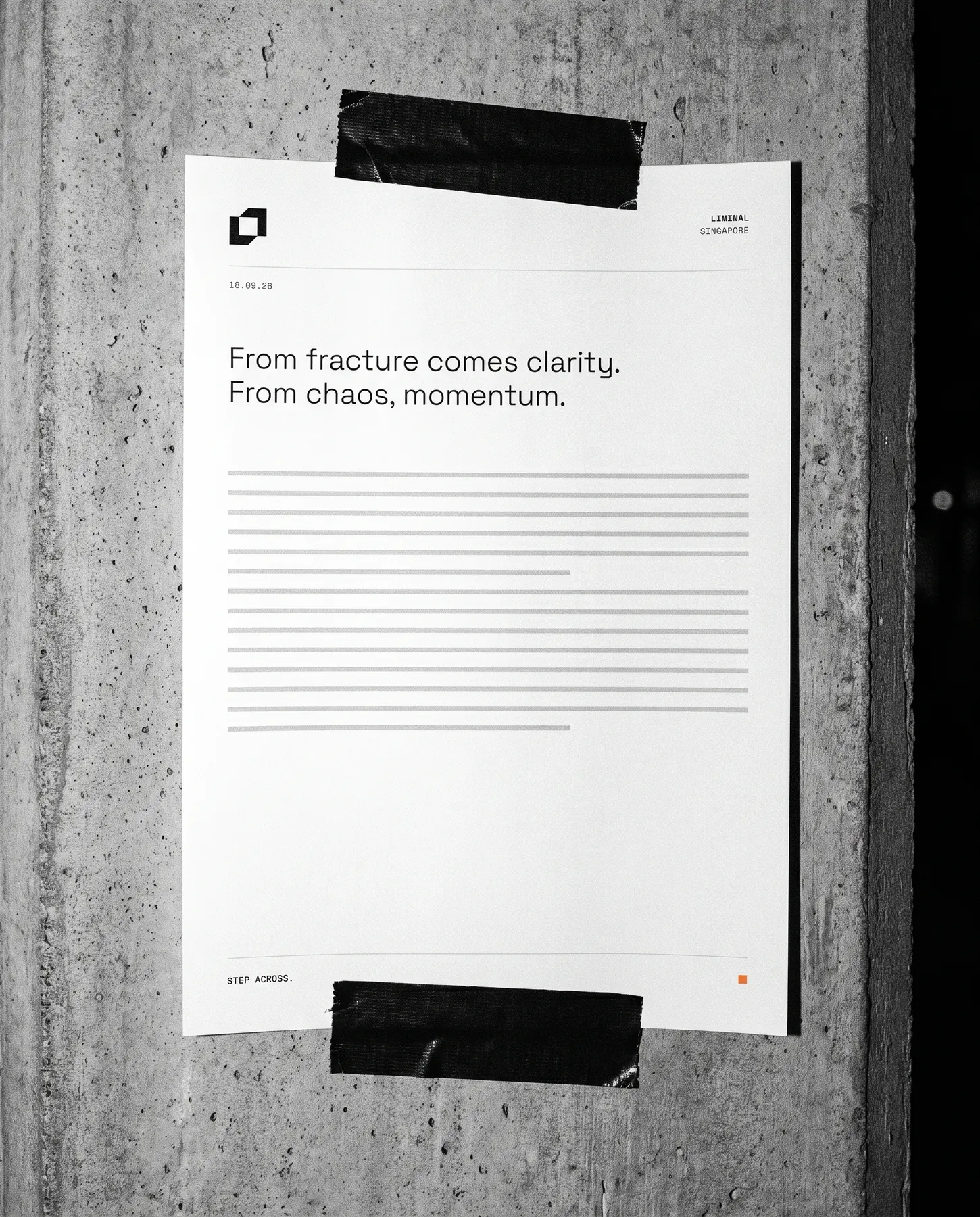
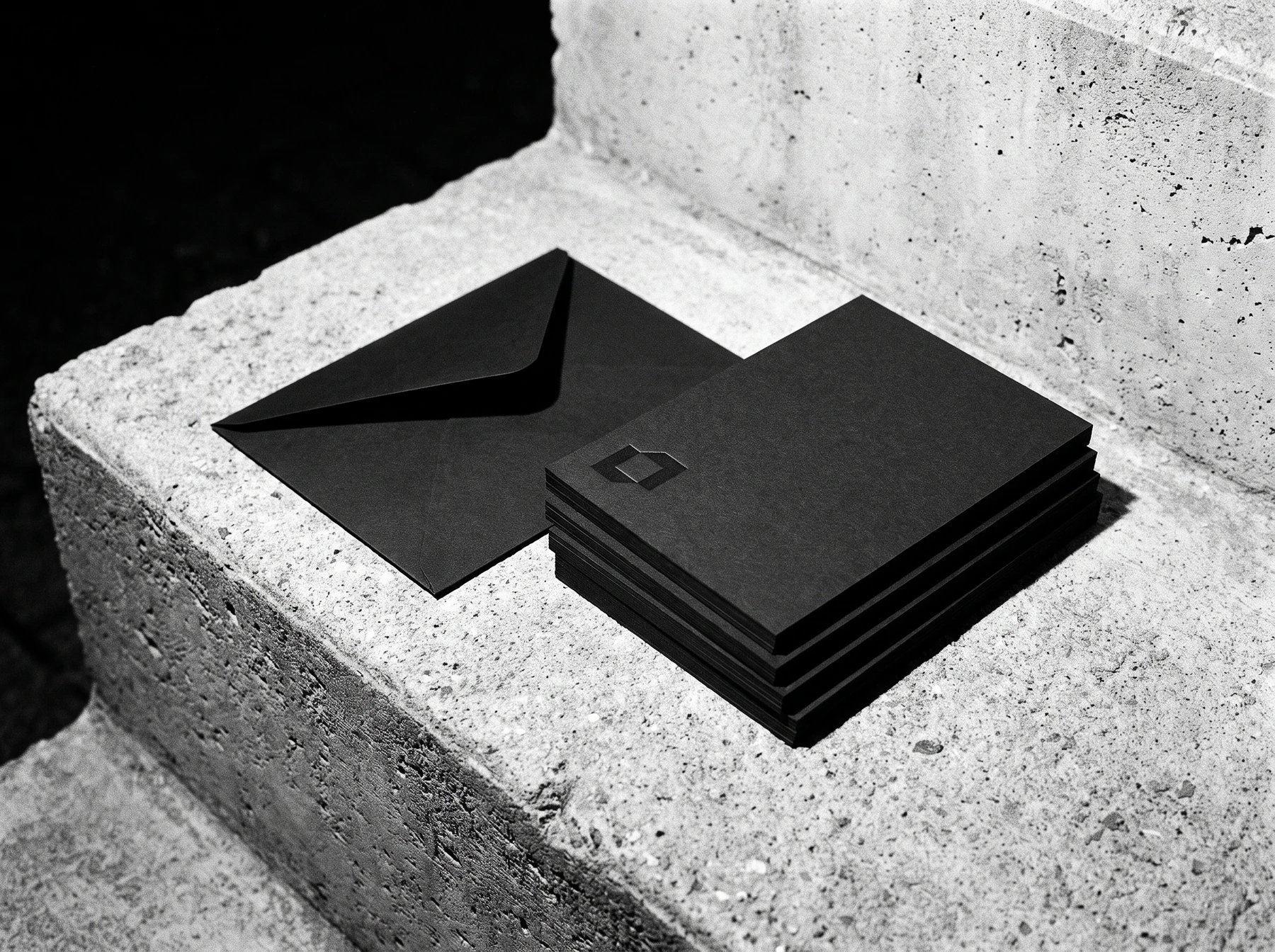
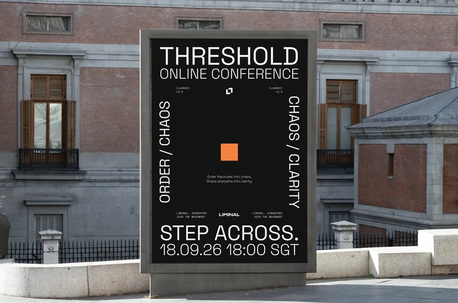
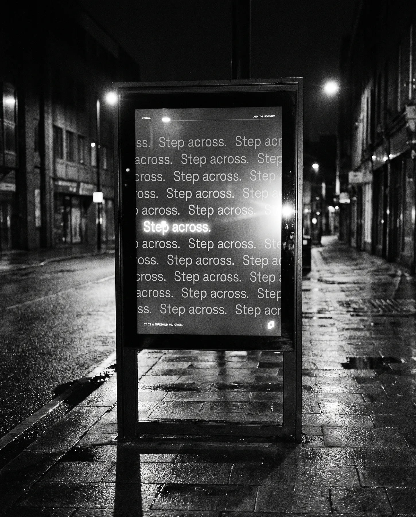
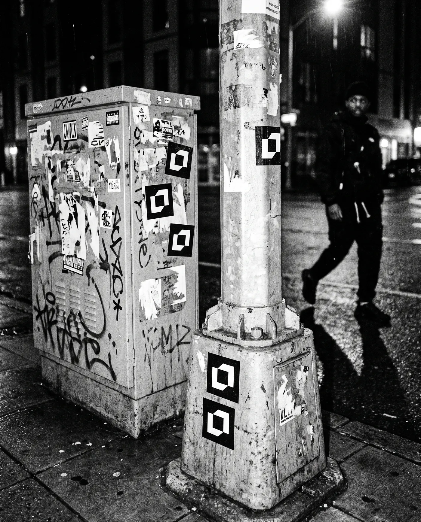
- Merch, posters, event and street
Create a cult.
Every founder asks Liminal the same question: so, are you a VC? The brand does not answer it. It gives people a symbol, a language and a way in.
Two brackets on a four-unit grid. They meet at two points and never close, so the mark always reads as an opening.
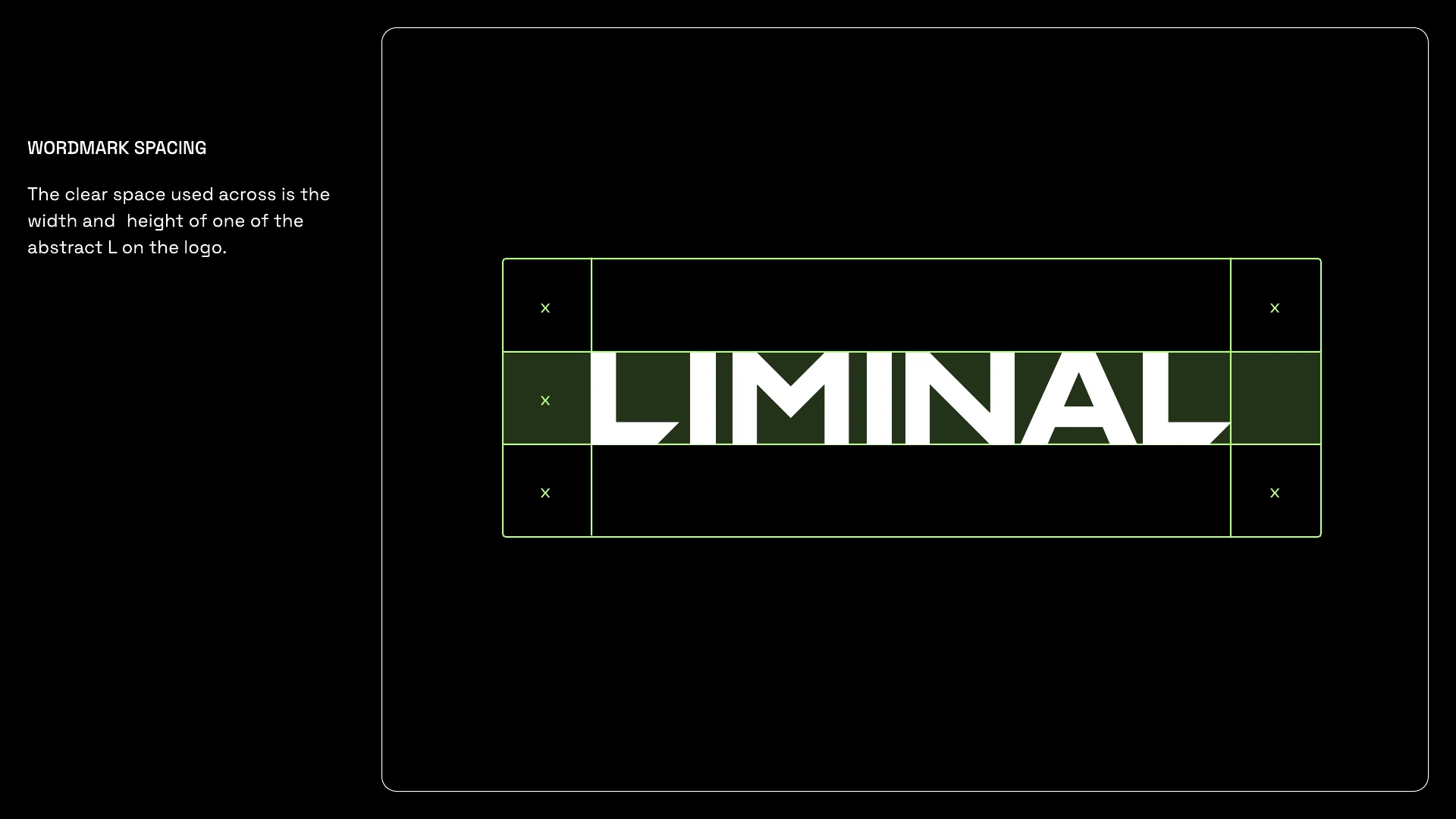
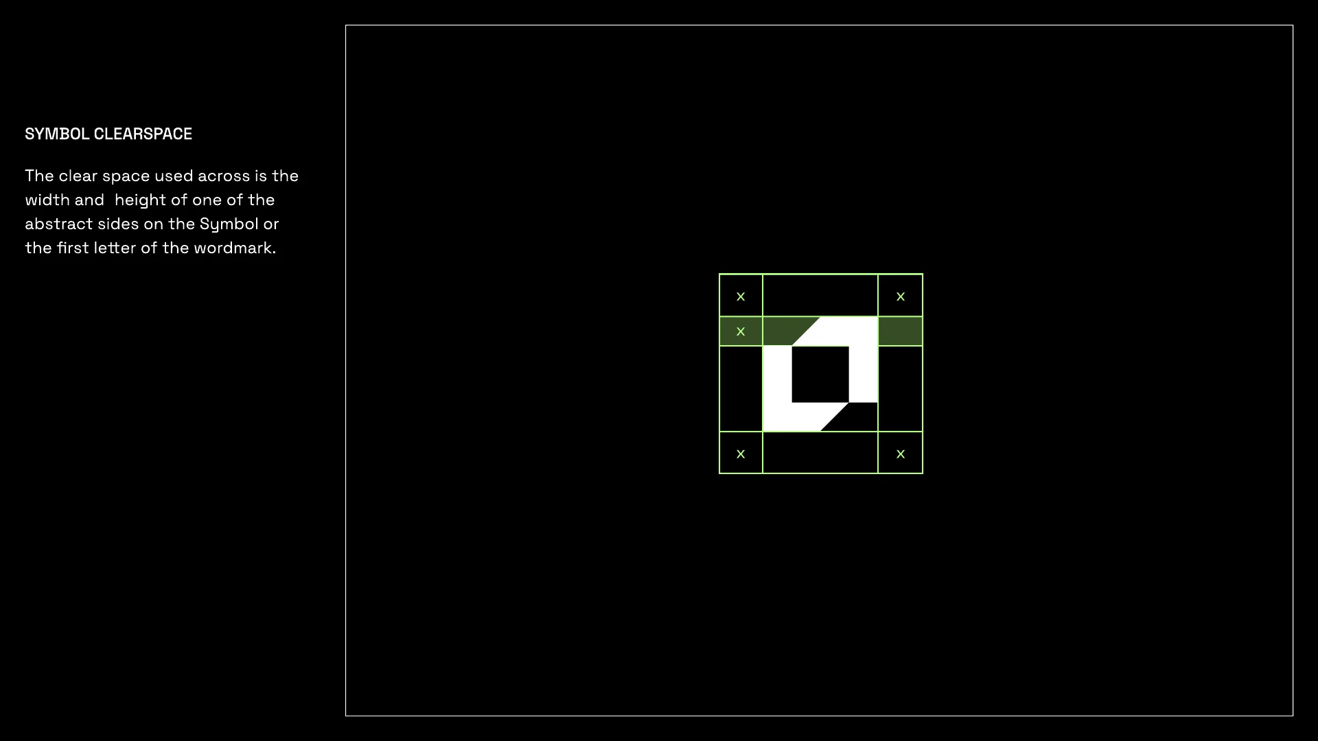
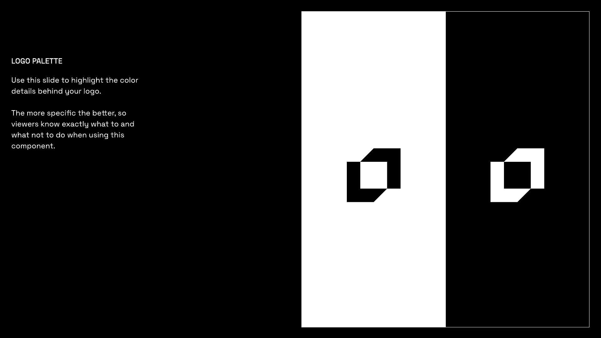
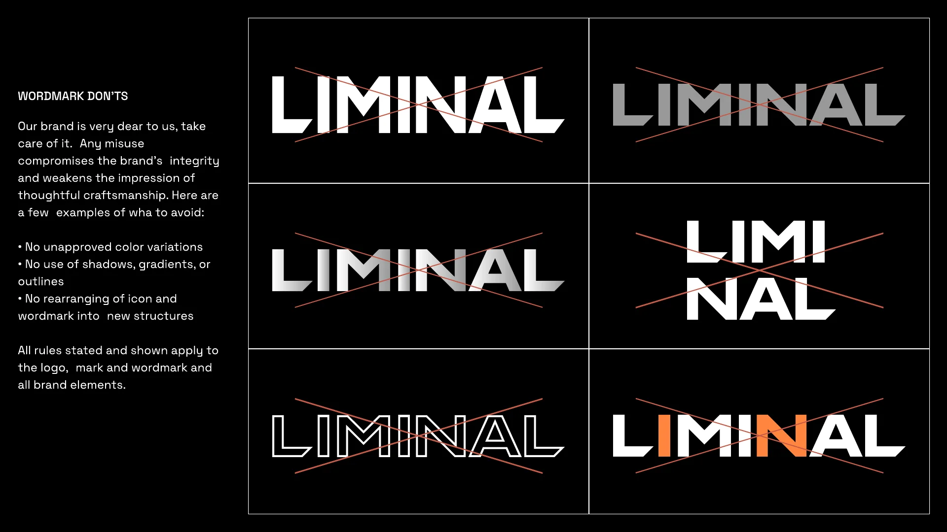
From the guidelines: spacing, clearspace, colour and misuse.
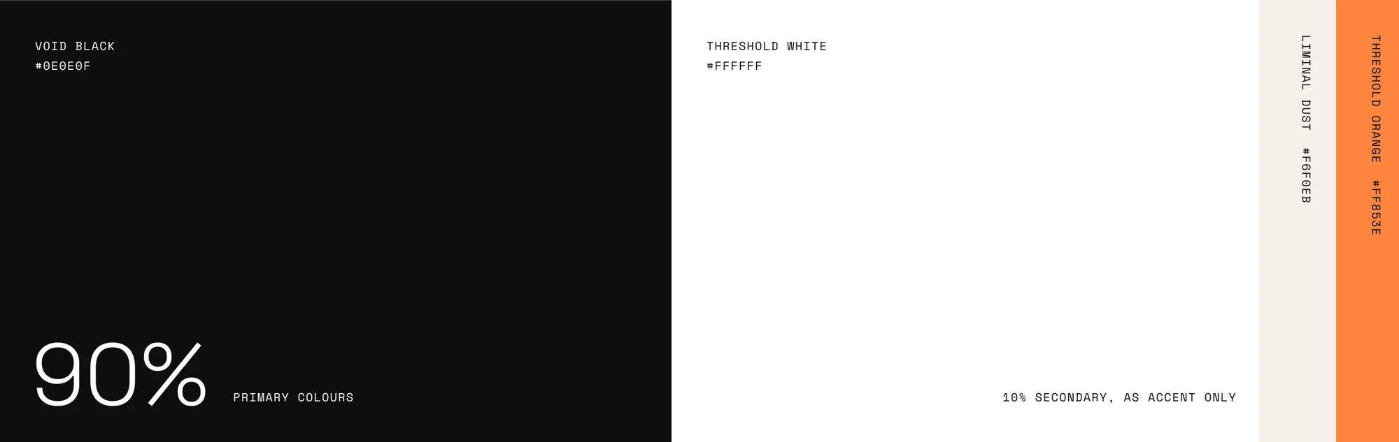
Black and white do almost all the work. Orange is the signal and shows up only when something switches on.
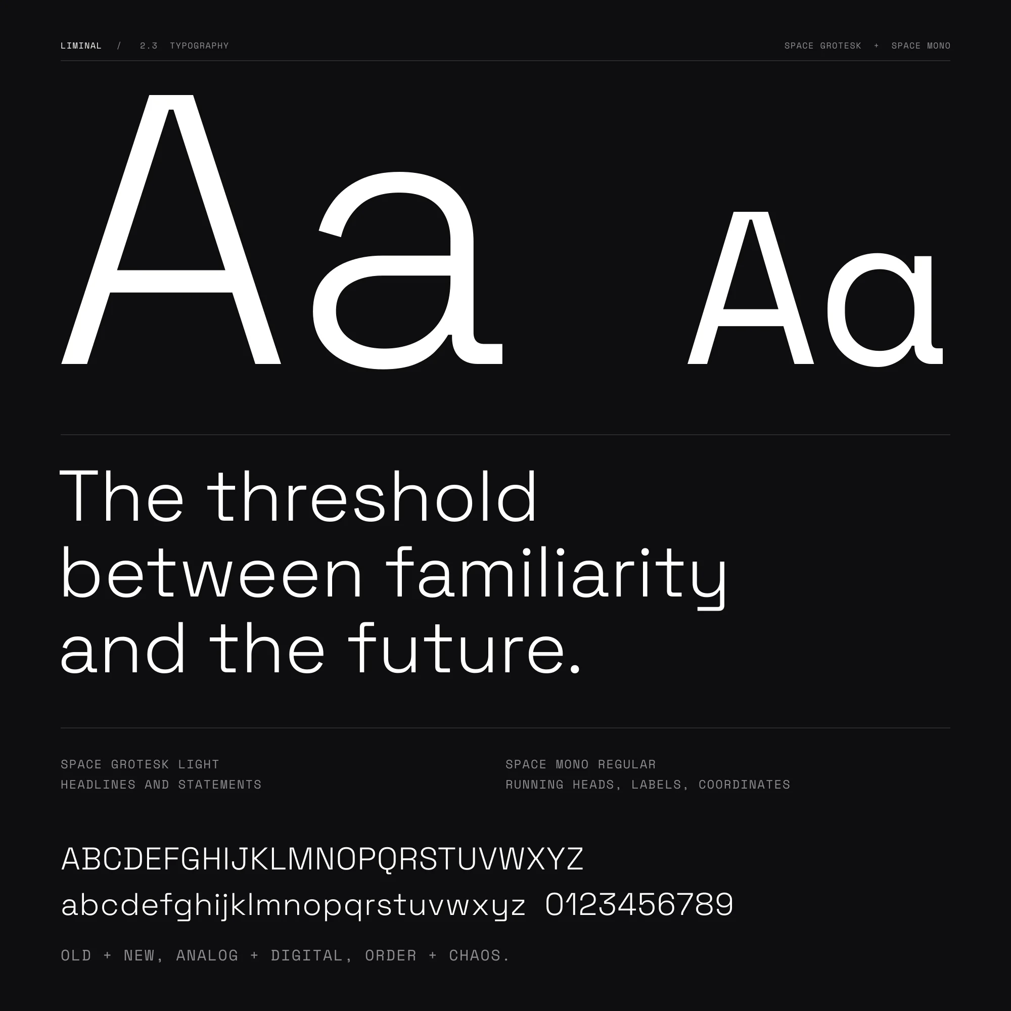
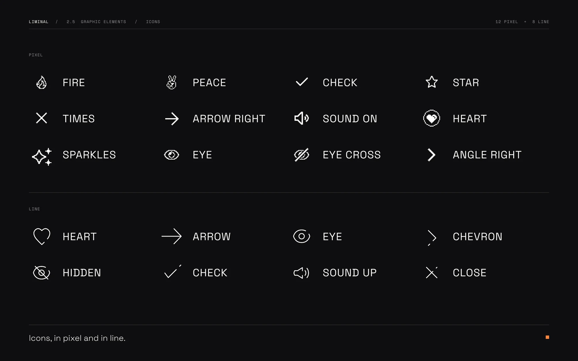
Regular grids hold the structure. Circular grids mark motion and focus.
Posts, slides and posters are all set on the same grid.
The grid in motion. Cells switch on, images sit inside them, the wordmark holds the corner.
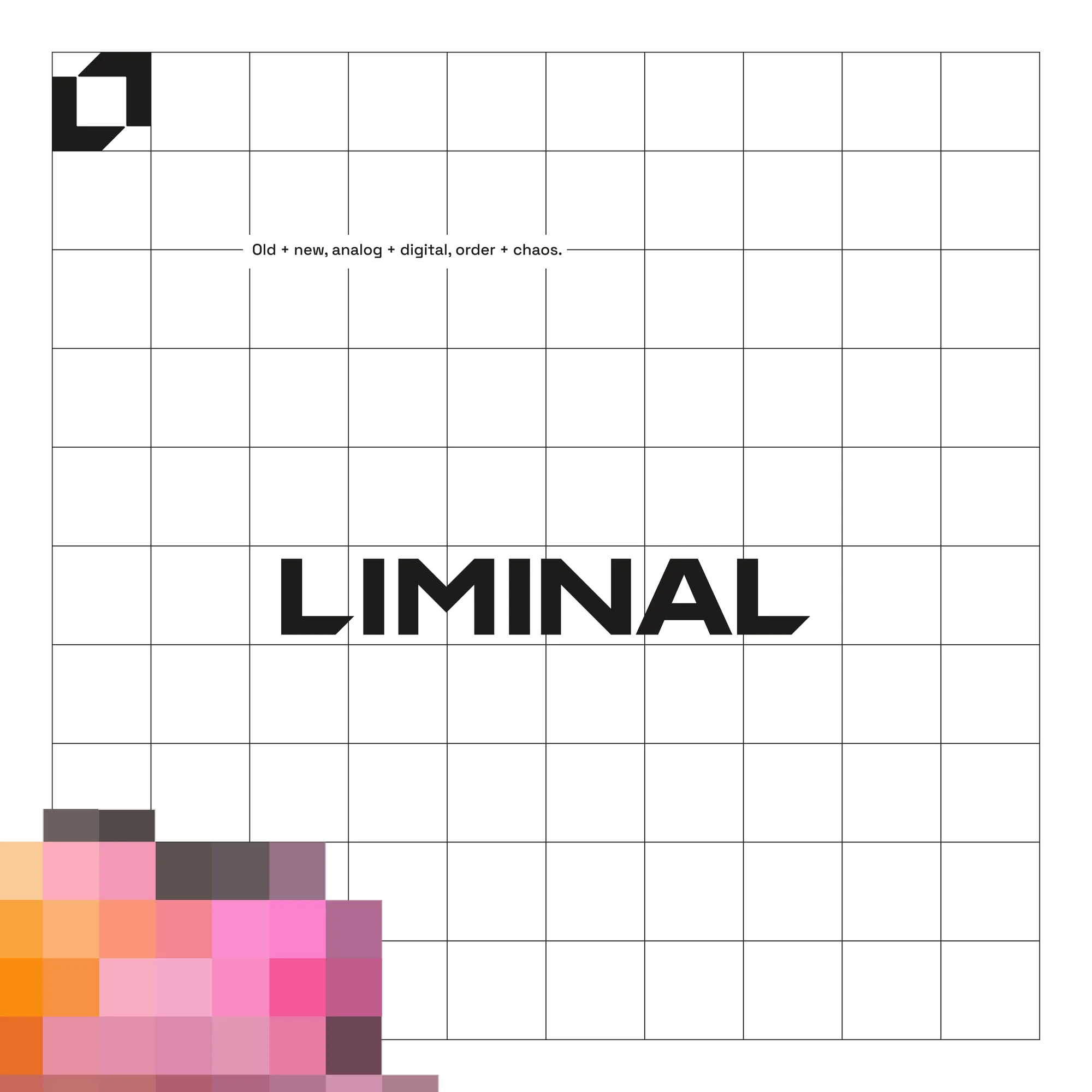
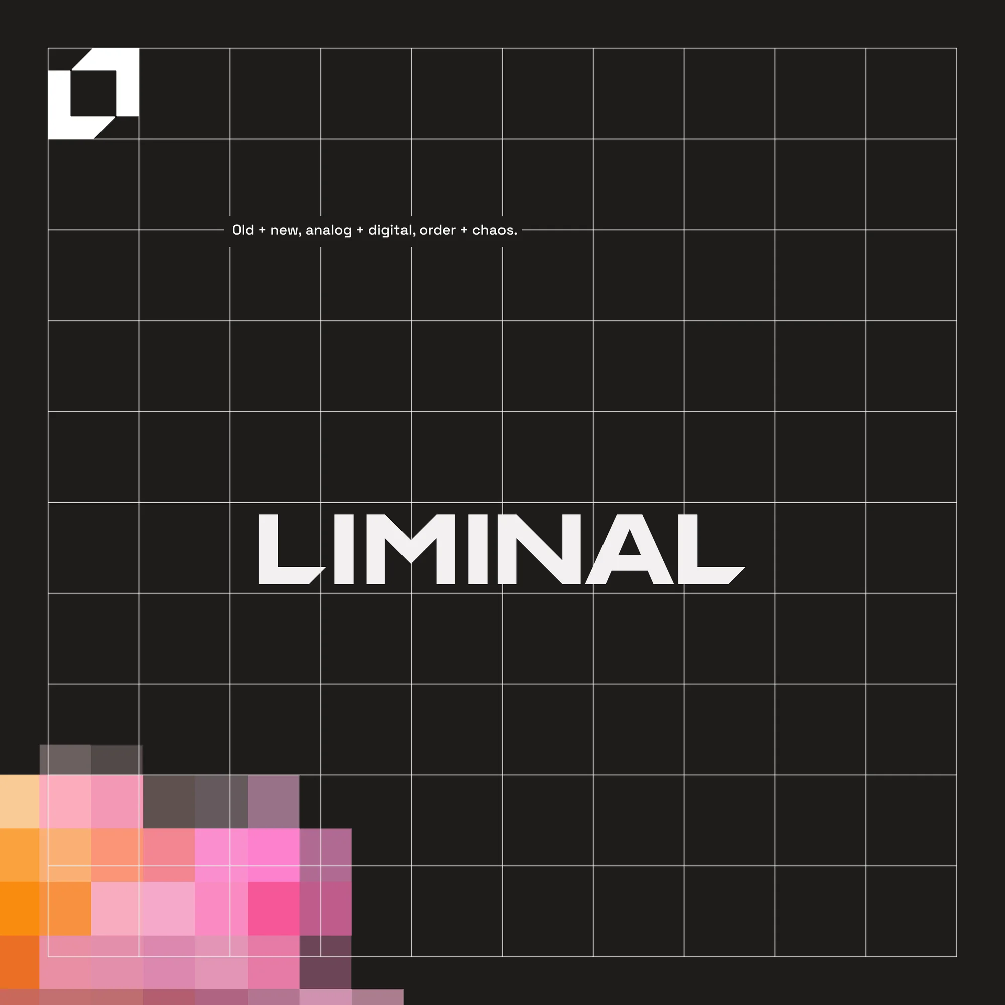
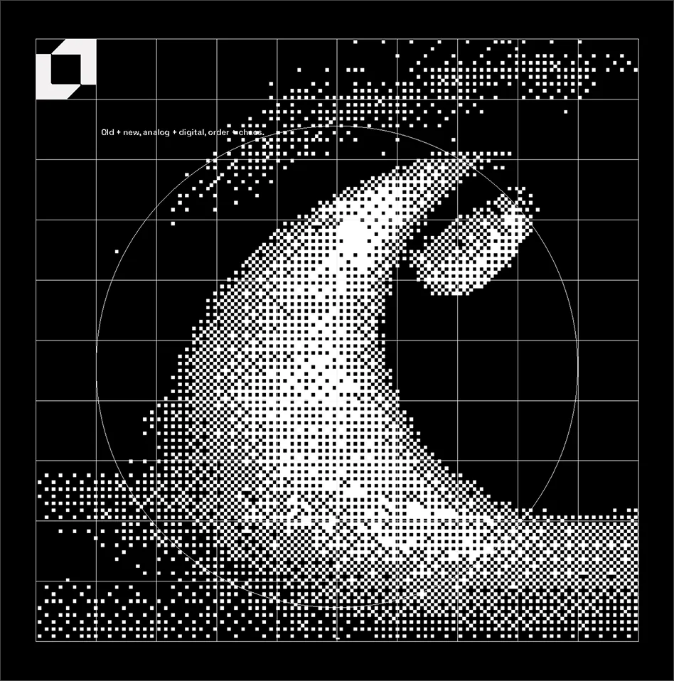
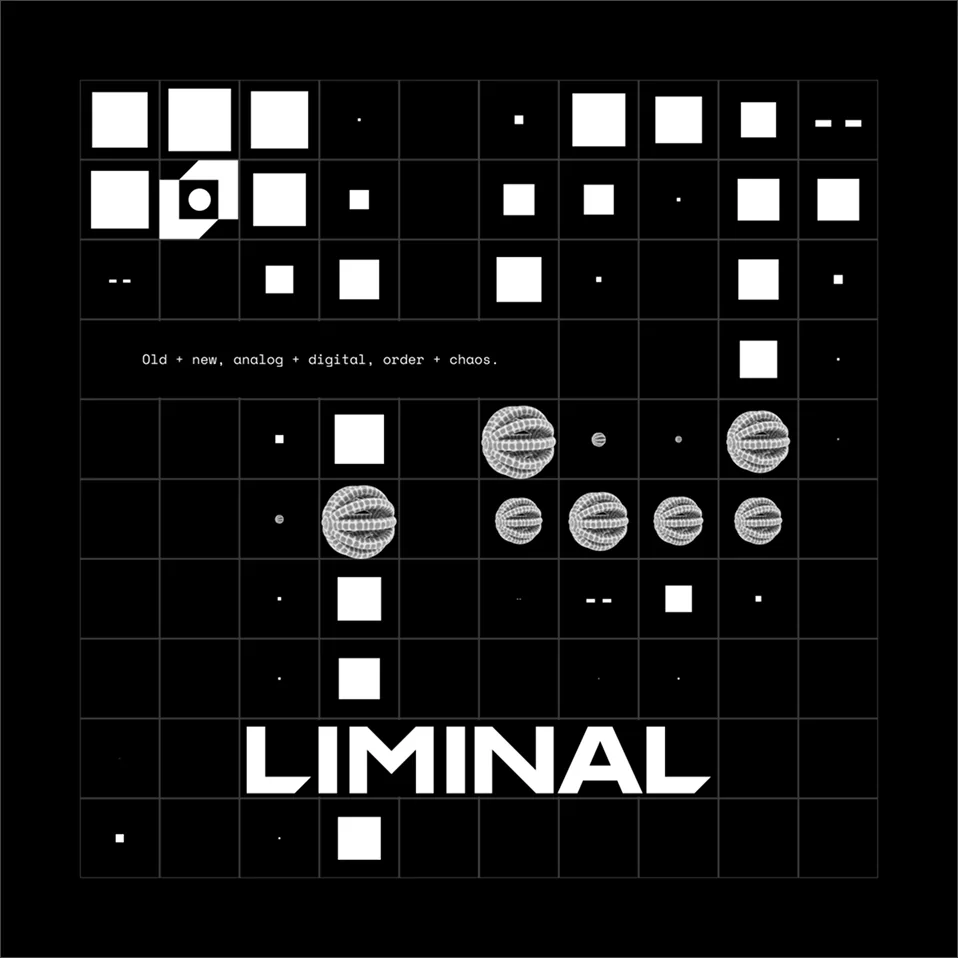
Each image can be read four ways: as form, as depth, as code and as pixels. One layer leads in every frame.
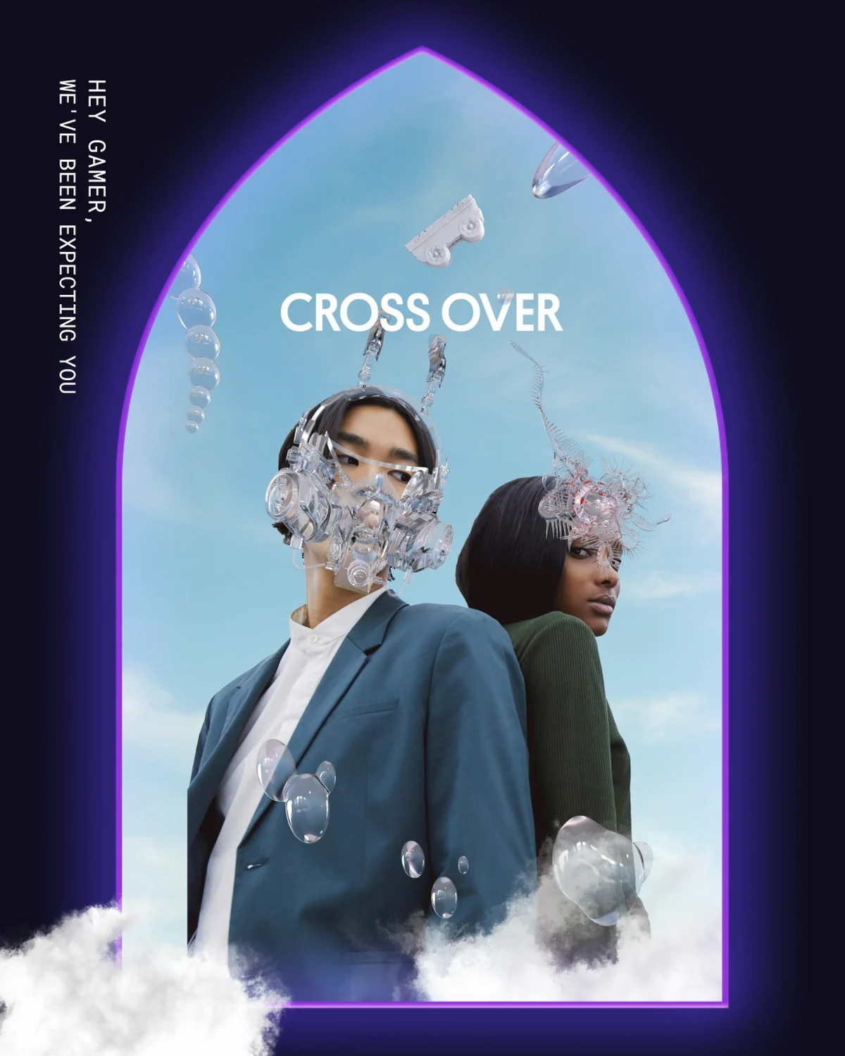
A library of 3D forms, built in Cinema 4D. They give a flat system weight and something to hold.
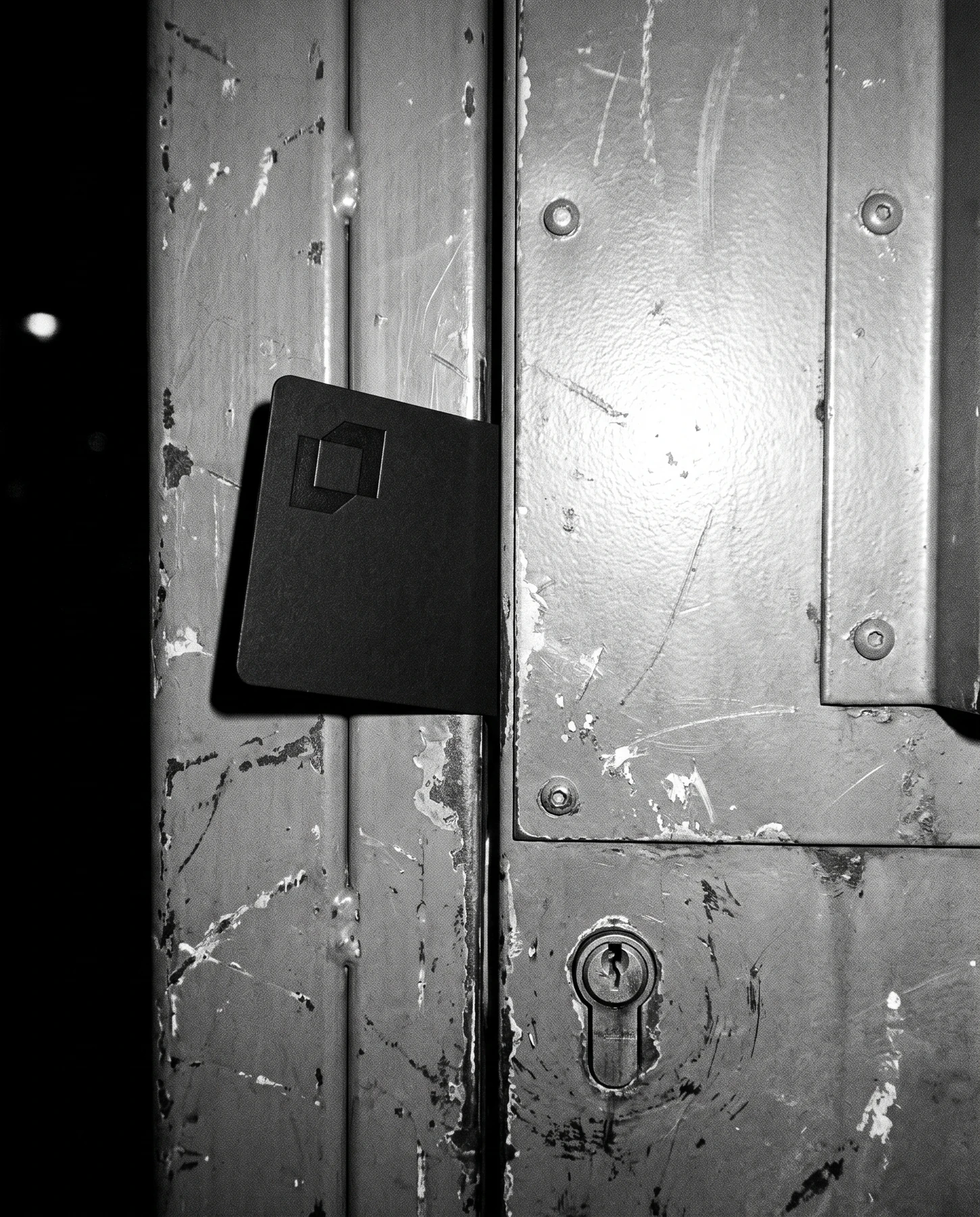
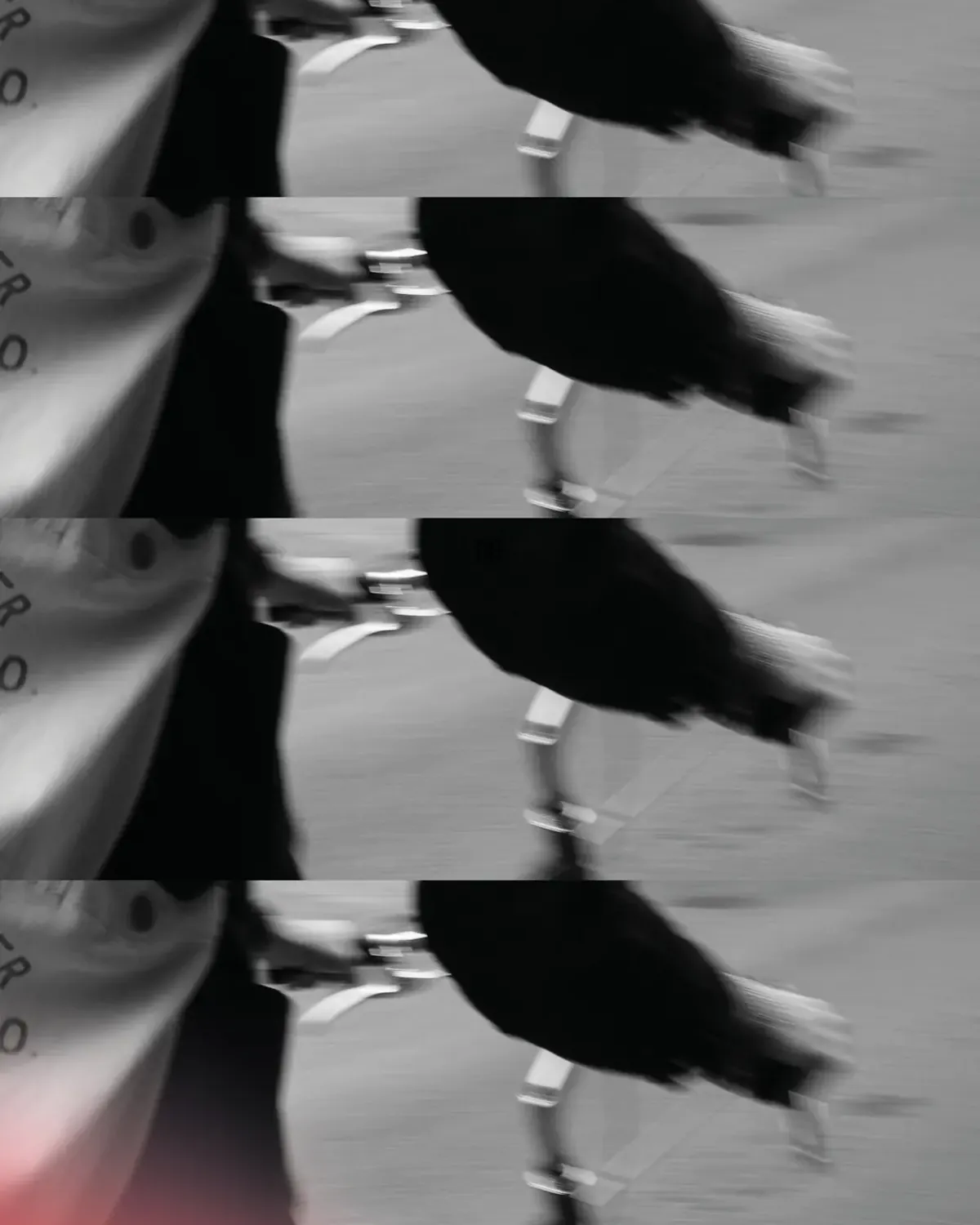
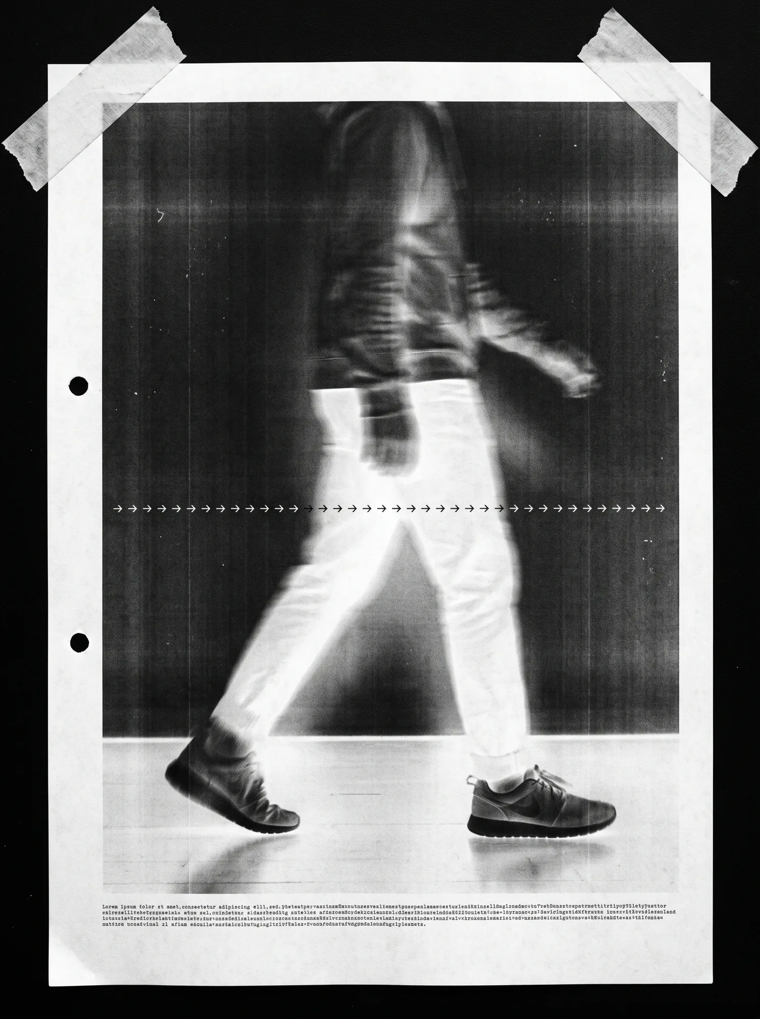
The photography is meant to feel found.
Scan noise, motion blur, and people who are only ever partly in frame.

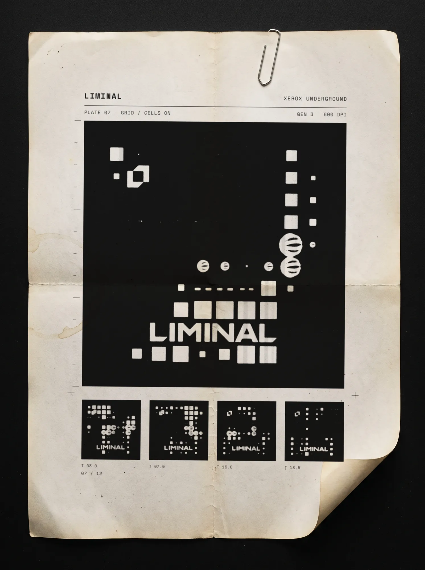
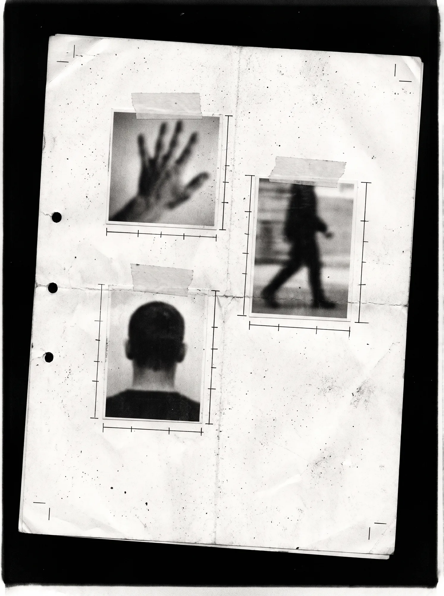
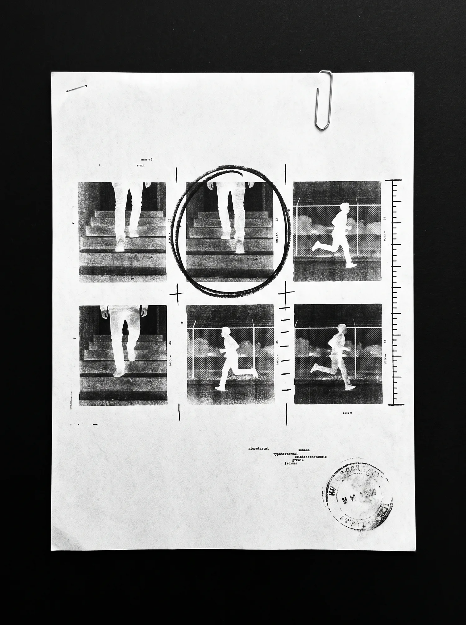
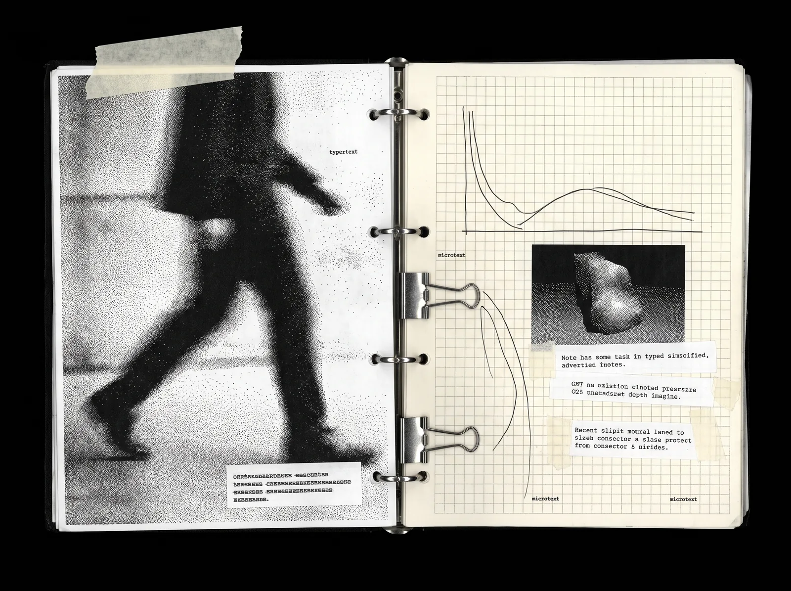
The same system on clothes, screens, paper and the street.